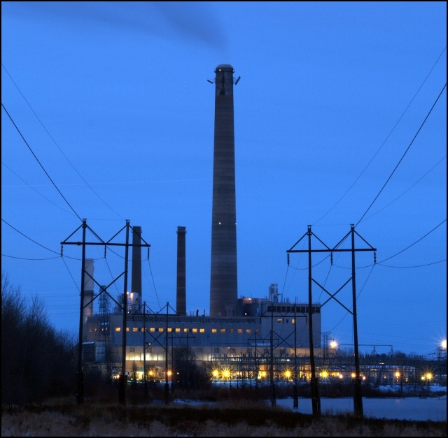
Shot taken at dusk, 30 seconds, just usm, color balance, croped, save for web. From about 1/2 mile away. This sucker looks awesome full size! Man, 10F Degrees suxs on a photo shoot.
BTW. This is Black Dog power plant, serves the south Twin-Cities 1.3 million customers. Its a coal and natural gas fired power plant. Located right on the Minnesota River, on a nature preserve. And yes it puts out about 1.21 GW at full peak.
Statistics
Place: 130 out of 223 Avg (all users): 5.2639 Avg (commenters): 7.0000 Avg (participants): 5.0761 Avg (non-participants): 5.3616 Views since voting: 1123 Views during voting: 332 Votes: 269 Comments: 19 Favorites: 1 (view)
I think this isn't bad. Let me see. First, I like the color of the dusk sky. That blue, to me, is quite appealing. I also like the star effect on the few lights. The composition is very centered, but I don't know if uncentererd would be better or not. I'd have to see it. Could you have walked to the next set of power poles and shot so the hill to the left wasn't there? The black of the hill pulls the shot down. Maybe here you could crop a little off the bottom so you have less black there.
The focus looks just a bit soft, especially on the power poles. I added some USM and it looks better to my eyes. (100%/0.7/0)
All-in-all, I don't think it's bad. 5.25 isn't a bad score. You almost hit 50th percentile, which is nothing to sneeze at in a challenge of people who like photography enough to enter.
I loved the color to this one with the rich blue sky the row of yellow windows and the star effect on the yellow lights. What hurt it, imo, was the composition with that dominant tower smack in the center of the shot. I like the perspective of coming at the building from the POV of the power lines, maybe that could have been played up even more by moving off to one side a bit and shooting right through them, offsetting that tower at the same time. This is one challenge where the presence of power lines and stuff don't make you absolutely crazy. They actually add to the meaning of the photo. :)
I gave it a 6 which is a good score with just some room for improvement. I don't think I gave anything higher than an 8 in this challenge. :)
found your pic in drachoo's topic, mind if i give it a try?
overall i think the picture looks too blue. even the factory has a blue shine, and the kind of blue ain't really nice.
The plant is centered and that makes it quite static. I can see where you wanted to go with the cables but imo they add to the complexity, the image is quite rough, too much objects.
Listen, I'm not mad or anything, so here's my take on it.
I voted it a 5. Technically the exposure was good, but the focus seemed to be a bit soft. As far as composition goes, I found it too centered, especially since the bushes to the left throw off the centered look.
But, aside from my vote, I believe that voters got over-exposed to shots of industrial plants. In both our case, it seems the box is either too full or too empty.
7 - Good shot, good symmetry. Criticism; want to say I'd like to see the 'smoke' more, but difficult at this angle/size. I like the effect with the lower lights. seems either a flaw or not sure, in the middle of the 'stack'/'tower' but could be lights. Overall the feel is good but seems just a little 'overprocessed', detracting (albeit slightly) from the main subject, in my opinion.




 Add photograph to your favorites
 Add photographer to your favorites

 Photographer found comment helpful.


