I was a little perturbed when I received this photo from the Critique Club and found the original comment I made, which may have seemed a bit rude. Nevertheless, I will do my best to provide some more feedback. Also, you should know that I still gave you a 5 despite the fact that I didn't find the color manipulation pleasing.
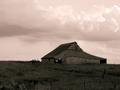
I think the composition on this is pretty good, if a little bit heavy on the right. This may be due more to the exposure of the lighting than to the actual composition. The bright ground on the left contrasts a bit harshly with the dark shadows in the trees and on the tractor. The dark lighting on the tractor gives it an odd feeling since it is presumably the subject of the shot but has less detail in it. It looks like it was exposed more for the background than for the tractor.
I really love the background, by the way. I think the lines and textures in the run down house are very appealing and along with the tractor met the challenge very well. The focus is also right on. The pinkness in the building and the blueness in the trees just seemd too unnatural and not fitting editing to do for a country life scene. I like the infrared effect in general, but think it would have worked better in black and white in this instance.
You have captured a nice country feel here. There is something about the tones that makes it 'uncomfortable' - the bushes attract a lot of attention away from the building and tractor.
The color is just a little too bizarre. Although it looks cool, I think it actually takes away from the picture. The picture would probably have been really powerful in black and white. Country life, I imagine, is a little more simple... lazy... plain. This is almost too creative. Good attempt.
Don't like the effect you achieved with the colors on this, but i think the image itself has a lot of potential of tecture and lines, and you may have ruined it...
In my opinion this shot would have worked better as a black and white or sepia. I am not a big fan of this technique. I do however like the composition, and find the visual elements very interesting = 5
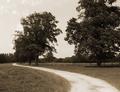
Great colours and (presumably) manipulation of hues and saturations. I love the composition and use of contrasts, the white of the tree works very well with the tractor. Effective textures, everything is very sharp. My only minor gripe is that possibly the composition feels a little too one-sided and unbalanced... especially with the curve that leads your eye to the tractor. 9






 Add photograph to your favorites
 Add photographer to your favorites


