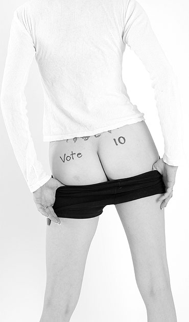
A very nice image. I would have named it, "or at least 8" Regardless, it shows a good sense of humor and the image is perfect as is. The light background conserves the object as humor whereas a darker background would make it perhaps too sexy rather than light in feeling. Nice work and yes, this should have finished higher.
I actually chuckled at this one. Good entry, good model, good pose, good idea. This should be a little thing, but I really don't like the ring on the model's left hand, and I would have asked her to remove it. I do wonder what this would have looked like in color... if you had some red panties, the pop of color would have been dynamic.
This photograph is visually pleasing, to say the least, but I don't see how the title is represented in the picture. Also i think the inscription on the model's butt detracts rather than adds to the photo. The framing and lighting are nice.
i like your title, so much potential in the title. too bad the photo doesnt really transmit the title very well.
on a more technical point, perhaps your background is too light, its an unpleasnt feeling tothe eyes to have such strong light its also distracting from the subject which i will assume is the "VOTE 10"
Vote 10? But there are only two buttocks. I think a compromise is in order. If you are going for the arrousal vote, it would have been a good ideal to lose the wedding band.
What wins me over on this photo this week is your use of color..or lack of. The contrast is excellent, the choice of pose is wonderful and I love the crop.
One thing. I loved the shape and color so much I almost wish you didnt have the vote 10 on here :-( This model has a wonderful shape and the light compliments her skin tone. Perhaps no "top 10" but show off teh tattoo more. That brings the shot to a more personal and sensual level.
I only comment on my lowest and highest voted photos. I voted this VERY low. Not only is it soliciting votes in an "even" sort of way, but I don't even find it appealing. There is a mark on her butt that is distracting, and I just find it bland and distasteful. EDITED TO ADD: Once again I cannot reply to your rude message in email, so I will reply here. Many have voiced wanting to know why they receive ones and twos, and I am complying to the majority. It "is" ironic that in the last two challenges you have received such a score from me, since I vote 2's not that often, nor do I know who the recipients are. Whatever the mark is, it is distracting. Ever hear of makeup? It's ok. I can handle the rudeness, but what I said stands true to my word. I just do not like your depiction of the theme and I do find it bland. Perhaps a black shirt to have matched the shorts or underwear would have faired it better. Hopefully, in the next challenge, you will receive a high vote from me and finally get some praise.
LOL, Great idea! This is what we call suggestive thought programming! hehe The only thing that I can see that would help this is maybe for your model to have worn a different colored top. It kind of gets lost against the background and it has a lot of blown highlights in it. Well Done though!





 Add photograph to your favorites
 Add photographer to your favorites

 Photographer found comment helpful.


