Well I like it ... not quite as much as mine, but I like it :p
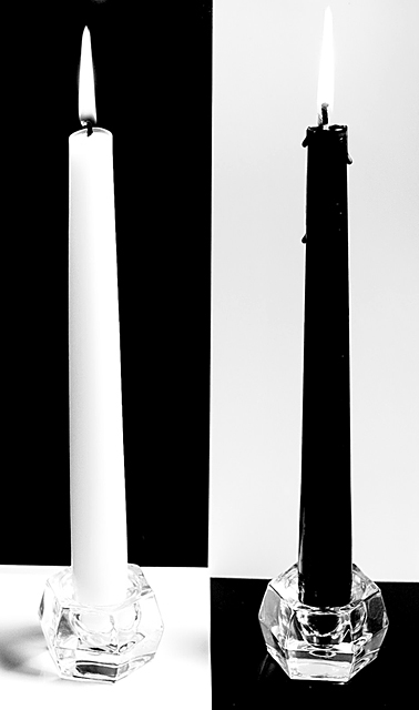
Really - this a great photo and deserved the early scores you got - not the angry-voter-scores from the end of voting. IMO - with a couple of advanced edits this is a wall hanger, basically just the definition of the flame on the black candle, spot edit some bright spots on black candle ... and I like the idea of black glass for white candle. Overall, imo, this is a well well well over 6 photo.
Very cool idea. I wonder if as your title says "grpahic balance" was sought, why not line up the b&w squares? Also, what kind of impact did it have if it wasnlt quite so hot on the lower left?
nice concept, execution could have been better IMO!! lines for "walls" could have been aligned better - and to me to make it better, black glass candleholder should have been used for the white candlestick, overall I do like it though
Nice picture and illusion! The illusion almost makes it seem "uneven" though (no points off for that!). Bummer about the black candle wax dripping. I like the pic!
I like this shot except for small two things... the gap between the two black rectangles, and the wax drip on the black candle. Throws off the evenness.
Ribbon material ... however, a detail or two gives you an 8 vote from me. My main hangup are the wax drips down the black candle. Shaving those would have made this a stronger composition in my opinion.
Also, the slight glare on the black and shadows on the white take a way (not dramatically) from the image.
Overall, it's a great compostion and I believe it will ribbon. 8
I love this. The only thing I would have preferred would be for the black and white to line up where it changes at the bottom. Great look at the challenge topic. 8





 Add photograph to your favorites
 Add photographer to your favorites

 Photographer found comment helpful.


