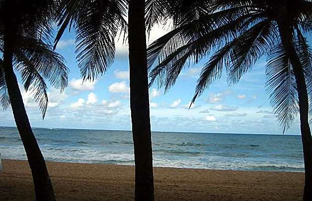
Nice colors, and interesting "window-like" feeling. But trunk down the center is a bit too much, might be better if you could get it further left and less central.
1 slanty horizon.
Just a little bit of rotation would have greatly improved this image. It is best to start being away of this when composing the image incamera so you dont have to crop the scene later to get the horixon balanced.
lol, you write your own comments.
A good job considering your problems. A straight horizon would have ruined the composition and a step back would have showed more of the whatever on the left.







 Add photograph to your favorites
 Add photographer to your favorites


 Photographer found comment helpful.


