Author Thread Comments Made During the Challenge
Post actions
Could be an interesting shot, but there's nothing in focus!
Post actions
Less blur would improve this a lot.
Post actions
i like the idea here but the pic seems out of focus, something just doesn't seem right to me
Post actions
Very nice idea for the challenge. Very well composed. The focus seems a bit off thought - nothing is really in focus.
Post actions
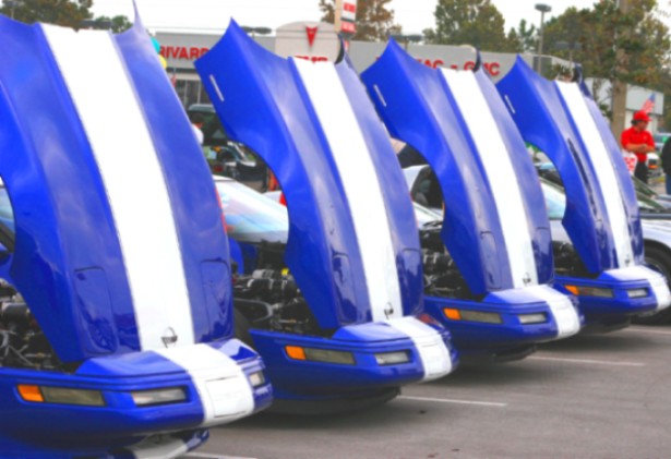
I think the man in red at the far right side of this image is distracting. I guess I would have tried to crop him out.
Post actions
Seems a little out of focus to me.
Post actions
Post actions
Post actions
Few steps closer and better focus... would've hide the overblown sky, and bring out some details. Very effective image though.
Post actions
Yes, 4 cars (Corvettes?) which makes it even, but the way they're shown with the hoods (bonnets) open certainly is odd. The image does appear a little soft to me, nothing is quit focused.
Post actions
Like it but wish it could've been a litle sharper (it looks a bit blurry to me)
Post actions
Love the gran Sports vettes but am not moved by this picture.
Post actions
Post actions
Good idea....lacks clarity though.
Post actions
Well seen. This could have done with slightly sharper focus I think.
Post actions
The image needed more focus IMO to be effective.
Post actions
seems slightly out of focus. But it's a neat concept
Post actions
It fits the challenge but it's not very sharp. Four Blur?
Post actions
The focus could be better.
Post actions
Looks like this picture could use more focus...
Post actions
Good shot. Too bad it is not in focus.
Post actions
A bit out of focus and too much saturation for my taste. The concept is good as is the composition.
Post actions
Great lineup, the repeated blue-white contrast is effective. Wish the image were sharper - might try to rescue it with Photoshop USM.
Post actions
visually interesting, good application of the challenge, but I wish the light wasn't so flat. Wouldn't it be nice to just be able to get a sunny day by wishing?





 Add photograph to your favorites
 Add photographer to your favorites


