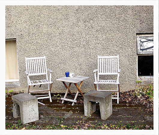
nice idea but the bg is very distracting with the cut off windows on either side, and it needs a cw rotation, What could have worked here was just the table and chairs shot low perhaps for a different perspective and closer to eliminate the chopped off windows because the stucco wall is a nice bg for the wood slat chairs - B&W would have looked nice too:-)
Nice texture and color. Why such a small picture? I think this would have looked better if youi took full advantage of the image size allowance. Then again, maybe the high level of overall detail was driving your filesize up... maybe there was just no good solution. I hate it when that heppens
If you had set up the shot with only two chairs against the background without including the window edges that would have worked very well. there is a bit toomuch going on in this photo for me.
I think this is screaming for black and white. It would have so much more PUNCH. I like all of the angular qualities. Maybe one round thing sitting on the table or a ball on the ground would have helped break that up.




 Add photograph to your favorites
 Add photographer to your favorites


 Photographer found comment helpful.


