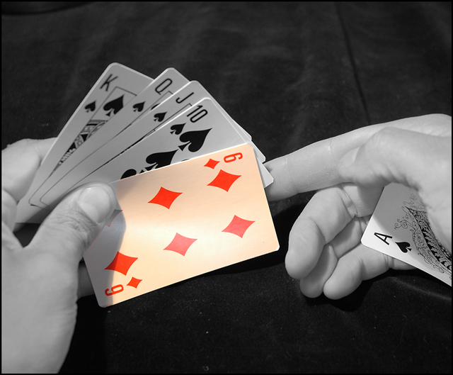
Your photo suits the challenge well and has very nice composition. The creamy color background of the card that is still in color really doesn't go very well with the B&W of the rest of the picture. Perhaps a very light sepia color might have went better with the colored card and made the whole thing look more together.
Nice take on the challenge. There are lots of similar ones, so there is a competition here. The right hand looks too plastic, either because of the NI, or as a side-effect of desaturation. The background is also an unlikely background for the poker game, could have been straightened and ironed.






 Add photograph to your favorites
 Add photographer to your favorites


 Photographer found comment helpful.


