Challenge:At Work (Classic Editing) Camera:Sony DSC-F707 Location: Virginia Beach, Viginia Date: Jun 22, 2003 Aperture: F/8 ISO: 100 Shutter: 1/200s Galleries:Snapshot, Candid Date Uploaded: Jun 22, 2003
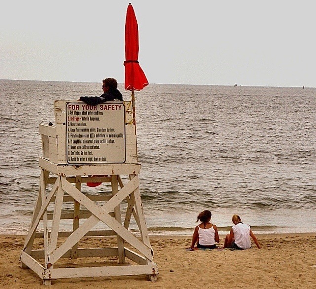
It's a pretty beach. I think this picture could have been a lot stronger - the focus is a bit on the thin side (heavily underlined by the blurred words on the sign - and when I go searching for what is in focus, I can't find it), and the life guard is so shadowed it's hard to see details of his face (probably in part focus, but also the lighting there is overwhelmed by light off the water behind him).
It might have been worth playing with a sharping mask or trying to get a clearer shot to start from, and lightening it a little (although the difference between the lifeguard and the tower he's sitting on might have made that difficult to do without making the structure glare).
I like this but the colour cast takes it down a little and mutes the effect of the red material. Makes me wonder if it would look better in b and w - 7
It looks cold here. Perhaps it's the lighting or it just plain was a cold day. This picture could probably have been in better focus. I'm not able to read the sign. You did meet challenge, however, it might have been nice to see the front of the lifeguard stand. 5 Good luck in the challenge.
A nice picture, but if this pictue had been sharp and clear, it would have been possible to read the text on the board. It also seems oversharpened, for some reason, and it somewhat bothers me that the horizon is not straight. Not a bad idea, however. (4)
When lining up a photo it is always best to get the horizon exactly level and the rest doesn't really matter. The horizon is the important view point. Other than that a good shot - 7.







 Add photograph to your favorites
 Add photographer to your favorites


 Photographer found comment helpful.


