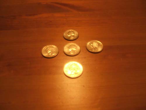
Keep trying - needs better focus, more DOF, more sharpness. If you have macro capability, move closer, use a tripod, and stop down. Try for a more interesting arrangement, maybe the tails of state quarters. Highlights should retain detail, the exposure in the foremost quarter is blown out.
Your symmetry is good, focus could have been better. I'm not sure about the glare on the one coin, it is distracting, but it also makes the coin distinctive again making it odd or different from the rest. I think a cooler WB would have helped here too.
The shot is quite blurry, and there's too much light on the bottom coin, so I gave a 4 on this. The table doesn't work well as a background, and also because it reflects light. It might have turned out better if placed on a cloth with a lighter colour that doesn't seem to blend in with the coin colour.
The choice of background was good for this shot, but sadly that's really where it ends. The light bounce off the front coin is too much and none of the coins are in focus. Also the composition is too centralised - it would have been better off to one of the sides. Nonetheless a good concept that would benefit from practising at.







 Add photograph to your favorites
 Add photographer to your favorites


 Photographer found comment helpful.

