I think this is great presentation of "even"
the colours and tones are even so is the picture itself. the eyes goes from one side of the image to the other very easily cause there is no realy depth or demension to the photo, it is very even
Statistics
Place: 126 out of 152 Avg (all users): 4.5828 Avg (commenters): 5.2857 Avg (participants): 4.1286 Avg (non-participants): 4.7198 Views since voting: 921 Views during voting: 405 Votes: 302 Comments: 9 Favorites: 0
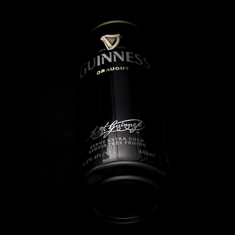
I don't care for the lighting here, I think you could have used a little more light to better develop the edges of the can while still maintaining the moody feel. Also, the highlight at the bottom of the can is distracting... sometimes moving the object around in relation to the camera and to the lights can move or remove those highlights.
It's also barely related to the challenge... photos that stand on their own without needing the title to link them to the challenge are usually much better off.
I would of liked to see the rest of the printing, but just a minor thing. A little more light might of helped there and given a bit more definition in the negative spce at the bottom.





 Add photograph to your favorites
 Add photographer to your favorites


 Photographer found comment helpful.


