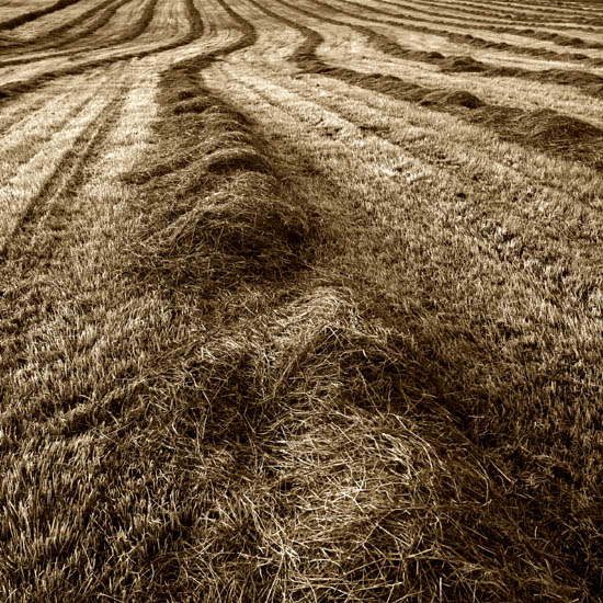
Great photo! The only suggestion I have would be to crop out a bit of the foreground thereby enabling the eye to concentrate on the rows of hay better.
I really like the sharpness, the tones, and the abstract feel to this. Not many shots in this challenge that were based on more of an abstract composition. Very creative, good vision. 10
VERY nice shot! (And one of my favorites so far...) The yellowish duotone works well, in my opinion, creating a warmth to your shot that draws the viewer in. The leading lines of the rows of cut hay create a great deal of interest, and force me to examine the entire shot. --10
Ooo...I really like the perspective on this one! Usually people try to capture the gold tones behind it. Yours are more earthy, I like that. The textures in the field make you want to rub it down to see if it's as soft as it looks. Excellent job. I give you a 9.
That's a great photo - lovely textures and rhythm. Only one question - why is there a comma in the title? (no points lost for the comma - just pointing it out)





 Add photograph to your favorites
 Add photographer to your favorites


