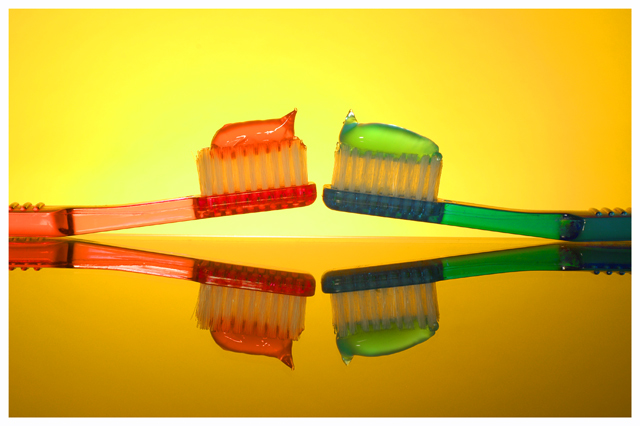
I love the colors you've used. This is a great shot! The only thing that sticks out to me and I only think it sicks out because of the title of this challenge is that it doesn't appear that there are equal amounts on each toothbrush or was that on purpose? It does draw an interest having it unequal.
7 - Really like this concept, including the reflection. Criticism; the yellow is competing too much in my opinion with this shot. Not sure if you focused on the reflection here or not, but I think that if the 'real' were a bit sharper would have made this even better in my opinion. To really nit-pick, perfect symmetry would be good too - the '3' grips on the handles and the 'lengths' of the paste/gel. Not sure on the white frame. edit:typo
My second most favorite this week. Why? Well..it's obvious..color!
Great composition, excellent thought, well exposed and nice touch on the backlighting. I think I may actually steal this idea in a way for an ad I am working on :-D







 Add photograph to your favorites
 Add photographer to your favorites


 Photographer found comment helpful.


