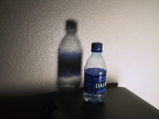
Well balanced composition, i would have like to not see the product's label on the bottle, though, because it pulls attention away from the shadow a little bit.
shadow on left, looks like a snapshot taken of your nightstand in the am. if you'd put more effort into your idea and/or expounded upon it, you would have gotten a much better score from me.
This looks like a starting point. From here you could play some more with the lighting to get rid of the glaringly bright right side (or just crop it off), find something more pleasant to look at like a glass vase from a 2nd hand store or whatever, and put something more attractive under the subject.
Nice, simple, but still a bit plain. Lighting is a bit too harsh on the right lower corner, (at the far corner of the surface, where the light actually hits. Photo 8 Creativity 6 Shadows 7 total 7
I'll have to admit that your shadow does have some nice color :) I'm not very impressed with theoverall concept of this photo... I believe that some additional impact could have been provided on this photo with a little different lighting setup and by applying the rule of thirds to the composition. Maybe a closeup view of the bottle and the shadow on a vertical crop? I think there are some possibilities here if you play with it a little :)





 Add photograph to your favorites
 Add photographer to your favorites


