Author Thread
Post actions
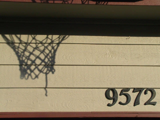
Thanks for all your comments. This was my first submission and it was a lot of fun. I actually did try cropping the top and bottom and just the top, but ended up liking it better this way. And I like the dangling string!! ;-) I should have leveled my horizon and should have tried to wait for a better angle of the sun - but I took this Saturday evening...lol.
Comments Made During the Challenge
Post actions
Hey, you're using my web identity! Stop that!
Post actions
Would like it better w/o the house number
Post actions
Almost perfect framing, I dislike the top part. Wish you could've waited and gotten a better angle with the light (ie- more net).
Post actions
You did an awesome job. The shadow seems to actually "match" the background. (8)
Post actions
I would trim about an inch or so off the top if it wre me. Otherwise I like it
Post actions
I like the one hanging thread.
Post actions
Nice combination of shade, and the numbers, which seem to have almost the same color. Need to level your horizons though.
Post actions
I think the actual net should have been composed within this photo to give it depth and show separation.
Post actions
i'd frame lower to avoid the clutter at the top - i just feel this should be more heavy at the bottom.
Post actions
Nice depiction of the theme.
Post actions
Post actions
I like the idea of the net shadow...but this would have been better on a different backdrop.
Post actions
Post actions
Post actions
Nice shadow :) I would have possibly cropped a little more off the topand bottom to remove the extras :) Good work!
Post actions
Post actions
Makes me wonder what was on the left of the shadow?
Post actions
Good title! To fit the title to your photo, I think you should have cropped closer to JUST the subject, IMO. (Is your house number supposed to represent your score/career points type thing?) Photo 6 (less than "exciting") Creativity 7 (your title helped here) Shadows 8 total 7





 Add photograph to your favorites
 Add photographer to your favorites


 Photographer found comment helpful.


