Author Thread Comments Made During the Challenge
Post actions
looks too much like a snap shot.....using the rule of thirds might have made a better picture.
Post actions
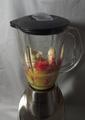
Too plain for my taste...nothing too interesting about the composition or framing of the object and the lighting seems a bit harsh and seems to wash things out a bit. A little below average for me (sorry) - 4
Post actions
looks like a straight on camera flash shot. not much interesting. perhaps use a dark sheet or velvet as a background? it would make it stand out more.
Post actions
This might have been a single light source, but I do not feel it is used dramatically.
Post actions
See what you were attempting, but the colours have come out dull under the flash. Perhaps could have tried a shot from about the bowl on an angle, with a different light source.
Post actions
The shadow on the right is not pleasing... the composition is a bit heavy and too centered
Post actions
You have a good eye for composition, but that camera mounted flash is killing your pictures!
Post actions
Doesn't hold my interest much. Maybe a different layout would help a bit, or a different POV.
Post actions
i think its miss theme and blurry image IMO sorry 2
Post actions
I don't like the shadow that is casted on the wall right behind the subject







 Add photograph to your favorites
 Add photographer to your favorites


 Photographer found comment helpful.


