Author Thread Comments Made During the Challenge
Post actions
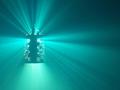
There is far too much empty space for me.
Post actions
Post actions
Effective blue with blue with blue title. Tighter might be better, try cropping.
Post actions
Personally, I would have preferred not to have seen the eye in shadow.
Post actions
I think a more of a close-up would have worked better cropped the 1/9 th in the center and you have a winner.
Post actions
I LIKE IT.RATHER HAVE ONE EYE.
Post actions
COOL. Love the blue. That tiny glint in the right eye makes the shot for me. Maybe crop out some of the area to the viewer's left, but that's my taste. 8
Post actions
If this photo wasn't centered, it would have had a more unique effect.







 Add photograph to your favorites
 Add photographer to your favorites


 Photographer found comment helpful.


