Author Thread Comments Made During the Challenge
Post actions
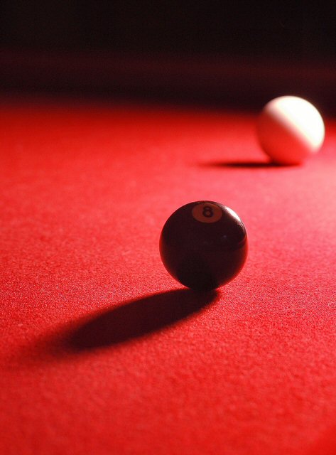
Nicely composed and lit... it's a shame that compression has shown up in the area around the white, but on the whole I like this one. well done.
Post actions
The 8 ball is a bit too dark for me, and understandably cause the light is coming from behind, but wouldve like to see more of it.
Post actions
Seems to be focused in the front of the ball. Would have been nice if it had been the 8 instead.
Post actions
Post actions
i dont like how out of focus the back is.
Post actions
Looks more like sunlight to me.
Post actions
Great use of DOF. Light/shadows work well together here. And I love the red surface.
Post actions
Might reposition the 8 ball to illuminate the number 8 more, as it is currently lost when it is the main feature. A little more DOF might help as the cue ball is also a major player.
Post actions
Post actions
nice lighting, but maybe IMO you should use higher apperture value to get a little bit sharper white ball. also nice contrast 6





 Add photograph to your favorites
 Add photographer to your favorites


 Photographer found comment helpful.


