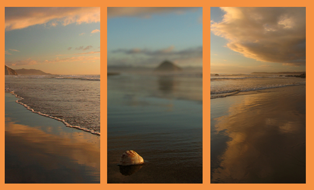
Three shots from a beach near Morro Rock (the dark rock in the center shot almost 2 miles away) Morro Bay Calif. Center shot is a macro of a shell about the size of a nickle.
The orange was supposed to be peach but came out wrong. What I had planned to enter [but couldn't update :( ] is on my portfolio.
Statistics
Place: 70 out of 234 Avg (all users): 5.8924 Avg (commenters): 6.4783 Avg (participants): 5.5932 Avg (non-participants): 6.1579 Views since voting: 1336 Views during voting: 448 Votes: 251 Comments: 23 Favorites: 2 (view)
i think the color of the border was a little too harsh for this picture, bu ti do think it's quite lovely... maybe just a little dark by my monitor... but i do like it a lot...
Your frame colour, adn the sudden on-set of bokeh in the middle shot, disturb this collection for me. The colour I think removes the impact of the sunset colours in the actual photos, and the placement of the distant rock in the centre frame seems far stronger than the placemtn of the in-focus subject - my eye is constantly drawn there. The overall shaping of the outer scenes, pushing the attention to centre, and then the very strong thirds placemnt of that out-of-focus rock are what cause that I think. Given the uncomplicated nature of landscape photography - I mean the lack of complexity of reaction it provokes, such dissonant composition seems rather unuseful
Great colors and the focus on the center is great. (although I can't quite tell what it is. shell?) I think that having the water be more even on both sides would be more appealing, but perhaps less interesting. Border is a nice shade. 8
This is really beautiful. The only thing I would change is the color of the border. Not sure I like the orange so much. It doesn't really detract from the beauty of the photos though.
The pictures are beautiful and make for a very nice triptych but the border color distracts from them, to me anyways. Maybe something a little more subtle? I had a hard time with colors as well. :-) 8
the matte color kiills me - what is a beautiful accent color in your images becomes overpowering - would love to see this on black - beautiful images -
5 - Good concept. Criticism; the framing color dominates and detracts from the colors and detail in your shots in my opinion. Like to see #2 with sharper focus on the shell, or perhaps just 'closer' to the shell/sharper angle, not sure. The feel within the shots is nice, especially the first, with the edge of the water coupled with the reflection, but I do not think #3 complements it, as the edge of the water is visually much further back, even though it also has a good reflection.







 Add photograph to your favorites
 Add photographer to your favorites


