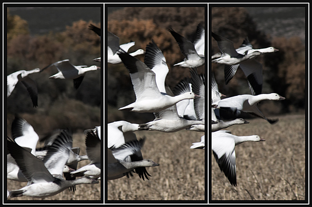
5 - Good shot and nice colors. Criticism; 2 & 3 work better with this style than the framing on 1, in my opinion. Not sure on the placement/crop, perhaps with more space on the left in 1, may have balanced this more and been more complementary to a triptych. The frame colors/style works well. Up to 5 from 4, just wish '1' had as much clarity and detail as 2 & 3.
This is a really cool shot but the presentation just isn't doing it for me. I'm not sure if it would be better if the panels were farther apart or if this just isn't an image that works well with triptychs.
Very cool. Each panel could stand on it's own. They go together i n a nice vista. I'm not sure about the double color border, but I can't tell you what would look better. 8
THAT is an AWESEOME photo! It looks great in a triptich format, but I think I might like this one even better as a whole. It lookes like a great matted and framed office print. But I love it like this too!
How does the division of your picture into three frames enhance the photo? How does this "tell...a story or illustrates a concept or object" better than the original image?
I know this meets the challenge, but I am not a big fan on just cutting up one nice shot into 3 with distracting borders. Seems too easy, no real creativity required.






 Add photograph to your favorites
 Add photographer to your favorites


 Photographer found comment helpful.


