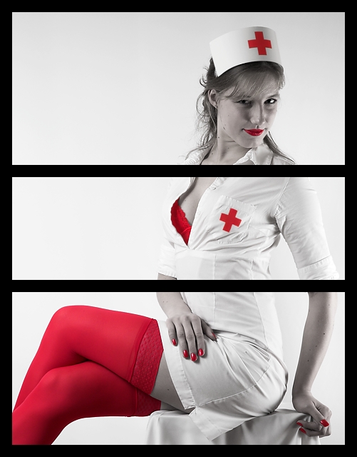
The concept illustrated by this triptych is the objectification of women, which apperently wasn't obvious to everyone even though my title gave it away.
This wasn't simply a picture that I took and cut up only to make it fit the challenge. I wanted to illustrate the objectification of women by "splitting" a women up into the three parts (face, breasts, legs) which is what men do all the time when they physically analyze women (and vice versa, of course). I tried making a combination of three different shots to satisfy the triptych theme a bit more, but decided to stick to one picture as it more strongly suggested that the woman is being divided into three at all times. The frame forces you to look at each part of the woman individually and prevents you from seeing her as a whole.
Thanks to ewaG for modeling.
Statistics
Place: 85 out of 234 Avg (all users): 5.8000 Avg (commenters): 6.6957 Avg (participants): 5.3543 Avg (non-participants): 6.1824 Views since voting: 2152 Views during voting: 775 Votes: 275 Comments: 34 Favorites: 1 (view)
The concept is great and technically well done, but to the contrary, it still depicts her as whole. I'd like to see the sections slid Left/Right slightly, to horizontilly offset the three sections.
Just thought I would share that I showed this photo to my husband and asked him what he thought... he got it right away. His only comment was that he thought the borders/divisions should have been smaller, only a couple of pixels wide and more subtle.
jen
Thanks. I'm glad some people understood it... I agree that the borders seem a little thick, but after comparison, I choose this size because smaller sizes just didn't seem to "cut the picture" enough.
Just thought I would share that I showed this photo to my husband and asked him what he thought... he got it right away. His only comment was that he thought the borders/divisions should have been smaller, only a couple of pixels wide and more subtle.
I thought this would have done better. Going by some of the comments I think you are right that people just didn't get the idea. I didn't have to see the title to know what you were going for. Hopefully, those that just didn't get it will come back and read your comments and finally see the light.
This is either the best or one of the best photos in the whole challenge. Brilliant idea. Beautiful red and white. Not too much, but not too little, and the lady is quite "objectified," as you put it. :)
Love the shot and coloring, but don't find the cutoff points pleasing. Cutting off her head seems to be a weird point. just not sure this was the right shot for triptych.
captivating subject and wonderful setup. I, however, don't see the point in doing this as a triptych, esp as this just seems to be a single photo cut into 3 parts.
but don't let my objections (pun intended) stop you, I want to see more :)
and on second thought, since I want more of this I bump you up to a fully objective 8
This seems to be divided just to meet the challenge, and I find the black very distracting. It might have been better to have a 1 or 2 pixel border around each panel and have the background white.
This is good, the reds and the whites together wow! The quality of the photo is also awesome, but what gets me, and what doesn't do this image justice is the thick black borders you chose. I would have reduced them a lot thinner, to at least a third of the size. For me they borders are taking too much away from the photo.
Why do I get the feeling that I know who shot this.
I will look it up after the challenge, i've been wrong before so I am not telling names anymore ;)
Very nice, and, I am not a fan of selective (de)saturation, because mostly it serves no purpose or doesn't do the pic any good, but here, well, uhm, it does.
This is a really nice glam shot, good use of selective desat, love the expression on the models face. But imho it doesn't really work. Yes you have made it into a triptych by dividing the image into 3 panels, but it simpley does not make sense as a triptych. The boarders are taking away from a perfectly great image.
OK, real nurses does not wear these red things, but I would lie telling I don't like this tryptich. Moreover, I find it compositionwise very sound - dividing picture into three self-containing parts and joining them in single frame is exactly how I understand tryptich. At least one of possible variations. Technically it is also very good - red color definition, shades of white. Content is a bit provoking, but it adds to picture too...10
How does the division of your picture into three frames enhance the photo? How does this "tell...a story or illustrates a concept or object" better than the original image?






 Add photograph to your favorites
 Add photographer to your favorites


