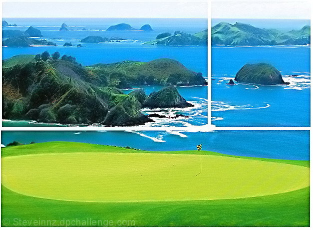
This is a nice shot by itself, but I feel like the division takes something away from it. Part of it is the color you decided to make the border. You lose it in the surf and the sky and that is distracting. I think it is also the way you decided to break it up.
The colours seem to be artificial ... too blue ... too green ... too yellow. I don't think that the white was the best colour for the frames ... It gets lost in the sky.
A nice shot, although a bit neon. My main issue is with the divisions. This doesn't really strike me as a triptych, but seems more like a photo with lines drawn through it and is especially difficult in the portion where there are whitecaps. Perhaps a thin black border would have helped. In addition, the top and bottom sections do not line up properly on the sides.
How does the division of your picture into three frames enhance the photo? How does this "tell...a story or illustrates a concept or object" better than the original image?
3 - Nice colors. Criticism; a bit 'over bright'. The arrangement and frame placement doesn't work in my opinion. The color and size also do not 'enhance'. The cropping / framing / padding is not symmetrical.
Beautiful picture and original division of image. I'm not sure that I like the white frame, though. It interferes with the waves. Black might have worked better.





 Add photograph to your favorites
 Add photographer to your favorites


 Photographer found comment helpful.


