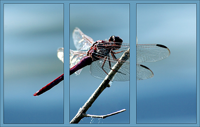
6 - Not many single shots were suited/enhanced by a triptych application in this Challenge in my opinion, but this was one that I liked. Good shot, nice and simple, good colors and well aligned/stitched. Criticism; as far as the triptych borders go, I think that either narrower spacing between the frames or a larger/wider padding on the outside (even though reducing even further the size of the frames) may have made this better in my opinion. The shot itself is good but the detail in the dark areas is lost a little, but this could just be a result of the reduction/size. Sharper if possible, perhaps a slightly different composition/crop (more space top &/or left, and 'less branch' at the bottom) may have also made this better in my opinion. Maybe a different 'cut' choice, especially in 3 as the very tip of the branch is showing, but this may have been your intent. edit:typo
This is another image i wish had been saved for the free study. Dividing the the firefly into three seems only to have been done to fit the challenge, and does not enhance the visual appearance of the image overall.
Nice shot, and I like the choice of matching border color. It looks like you sharpened after adding the border? The border lines might look cleaner if you add them after other post-processing steps.
I hate to say it, but this looks like a fabulous photo that's been ruined by arbitrary lines slashing through it. For a triptych to work, there has to be three of something. Three views, three parts to a composition, just something that calls for three panels.
This is a really nice shot but doesn't lend itself well to the triptych layout. The chopping off of the wings and back part feel quite awkward. A nice job on the graphical layout though.
How does the division of your picture into three frames enhance the photo? How does this "tell...a story or illustrates a concept or object" better than the original image?
I know this meets the challenge, but I am not a big fan on just cutting up one nice shot into 3 with distracting borders. Seems too easy, no real creativity required.
Not really sure this picture is enhanced by the triptych technique - too much action in the middle frame and subsequently too much space in the outside frames. It also appears that the internal borders are not equidistant/proportional to the rest. Nice macro shot though!





 Add photograph to your favorites
 Add photographer to your favorites

 Photographer found comment helpful.


