The focus seems a little off and the highlights are a bit blown out. Honestly I don't think this image lends itself very well to a triptych. There is no natural separation where you have chosen to break the image and the gray/brown background doesn't help either.
How does the division of your picture into three frames enhance the photo? How does this "tell...a story or illustrates a concept or object" better than the original image?
I know this meets the challenge, but I am not a big fan on just cutting up one nice shot into 3 with distracting borders. Seems too easy, no real creativity required.
Also seems over sharpened.
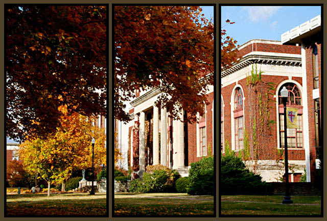
This looks great in a triptich format. I love the autumn feelto it. It may be just a bit over-exposed on the building, but I really love it anyway. Good luck.





 Add photograph to your favorites
 Add photographer to your favorites


 Photographer found comment helpful.


