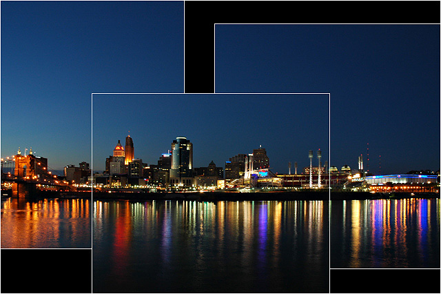
Interesting layout and wonderful colours in the reflections. I think the bottom of the first image is not high enough. To me it's just a little to close to the bottom of the third giving the impression of being sloppy rather than intentional. The current crop probably wouldn't lend itself to changing that though.
I just voted another cityscape last picture. You did creative things with the panelling and I think that somewhat overcomes the weakness of having the outer panels unable to quite stand on their own. Nice blue in the sky. 7
Nice innovative layout. The black background and thin white outline really heps to enhance these images. Very nicely done!! Hope to see it reach the top.
How does the division of your picture into three frames enhance the photo? How does this "tell...a story or illustrates a concept or object" better than the original image?
This is a very interesting format. I like how the scene lines up perfectly, but for interest, the panls do not. And the beautiful night shot with those amazing colors reflecting in the water don't hurt it either.
Interesting placement of the border's and pictures in general. I probably would of cropped the three pictures to fit each other so it is a little more seamless and smooth.






 Add photograph to your favorites
 Add photographer to your favorites


 Photographer found comment helpful.


