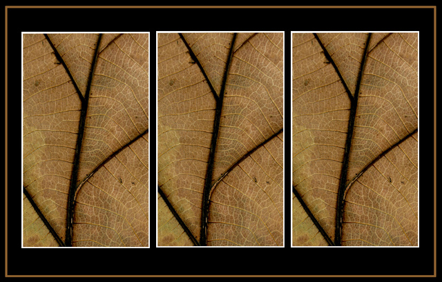
The only one in this challenge that has this kind of repetition. For that, it's bold. The shapes here are very strong. I think the triplicate imagery is effective. Good work.
Three of the exact same image without even a different angle? Yes, the image is very nice, but why not add two different angles, maybe of the whole leaf to the outside? Or even a close-up of two more leaves, different colors?
It takes a certain amount of bravery to repeat the same image, without variation, in all three panels of a triptych, in here at least :-) Based on comments my entry is receiving I suspect you're seeing some downgrading for this. Nevertheless, if any image can support that treatment, this one can. It is surprisingly complex, and somehow the double repetition forces a closer study of the singular, repeated image, paying dividends in greater appreciation of the thing itself. So I like this very much.
It made me stop and look hard, at least; but I don't get the point, I think. A certain geometry makes me belive it's the same shot three times, but the immediate imapct is actually of three slightly different shots. However, I'm not sure that such games with presentation are what you were after - it's so very subtle. You have, at least, submitted something of more than fleeting interest.
I love the warm colours and the texture, and I see this as a strong entry. I think 3 different views of the same leaf may have increased interest in the triptych even more. The border compliments the subject well.
great detail in the leaf, but maybe having a differnt crop in each panel would have made it a bit more interesting rather than the same shot repeated three times?
I don't know why, but the first association when I saw this one was: Andy Warhol. Can't grasp why, but there is some artistic value in this one that just struck me when it popped up in front of me. I like it very much.
Good luck!
I feel like I'm playing one of those "count the differences" games--these are the same photo right? Wouldn't work for most, but I kind of like it here, the repetition of an interesting texture and pattern. I think I would simplify the border a little (plain black would do it for me I think).
4 - Colors and framing are nice. Criticism; needs some variation, in some way, in my opinion, although I realize you may have been going for this 'effect/look'.






 Add photograph to your favorites
 Add photographer to your favorites


 Photographer found comment helpful.