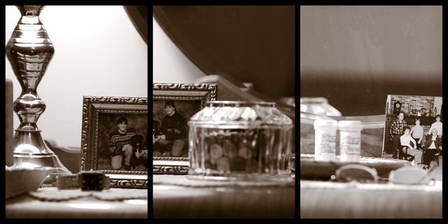
i like this apart from the right hand image.
It's definitely the weaker of the three.
there's nothing to really focus on in that picture?
too much negative space?
but a good effort.
I like the lighting and tones very much. Minor complaint is the two frames from the two images coming together seems a bit distracting. My eye falls there too easily. Maybe if the frame had been removed from the middle image and something else put there. Nice photo.
a lamp, a picture of the ocean, and my personal collection of dustbunnies.. hehe. Seriously though, this is very tastefully done, nice eye with the focus choices.. the only thing i can see that i'd do differently is #3 has nothing to draw the eye upward like the other two do.





 Add photograph to your favorites
 Add photographer to your favorites


 Photographer found comment helpful.


