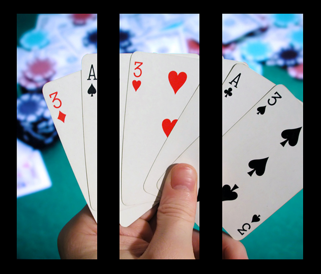
That looks awesome. I'm sure someone's already mentioned it, but I wonder if the cards in panels 2 & 3 lined up if it would give it just another added punch. But it looks great anyway, and I really like it!
How does the division of your picture into three frames enhance the photo? How does this "tell...a story or illustrates a concept or object" better than the original image?
I know this meets the challenge, but I am not a big fan on just cutting up one nice shot into 3 with distracting borders. Seems too easy, no real creativity required. Also the borders seem way too thick.
Too heavy on the border and the shot doesn't seem to lend itself well to being split up. Otherwise a good photo - do it again with 5 aces for the latest member challenge. ;-)





 Add photograph to your favorites
 Add photographer to your favorites


 Photographer found comment helpful.


