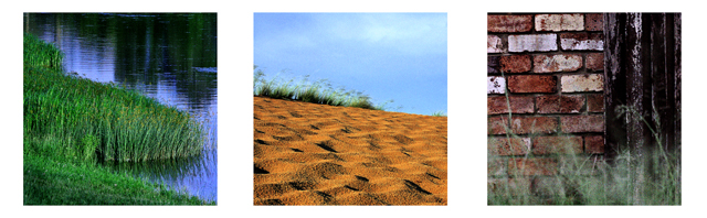
getting 3 outdoor shots in natural light with the same values was difficult...the shots i put together were not what I wanted but what i could manage without having an apoplexy....
the border ain't quite right neither....
Statistics
Place: 150 out of 234 Avg (all users): 5.4115 Avg (commenters): 6.3333 Avg (participants): 5.2764 Avg (non-participants): 5.5328 Views since voting: 762 Views during voting: 420 Votes: 260 Comments: 12 Favorites: 0
I like the idea. Unfortunately, the size limitations here on DPC really hinder this type of image. I think if this shot were larger it would be wonderful. The colors and textures are excellent. This is something I wouldn't mind having on my wall. Good Luck.
this might be weird but I would have tiltled it something different, although that is the thing that ties these together the grass is not in focus in the last image. I do like each of the images but not sure if the last belongs- it's got a whole different feel to it. Nevertheless I am giving you a 7 because each image alone is beautiflu.
4 - Like the concept. Criticism; of course you know how much detail you've lost at this size, but cannot be helped. The white background is not complementary to these shots in my opinion, not sure what color would have worked better. Arrangement, again not sure, the brick is a lot 'harder' than the first two and therefore seems a little out of 'line', especially seeing as the grass is out of focus in it, which likely works better larger, but in this, the main focus is on the bricks. Cannot discern what the 'sand' colored surface is in 2, guessing sand or earth, but the pattern makes me wonder. Perhaps, with the 'height' seemingly available in these shots of the grasses, a more vertical framing may have worked better, not sure.
I really love the subject, the mood, and the individual pictures. I think that if they were larger, perhaps with a thinner border or taller format, it would have had even more impact. But still a very strong compilation.






 Add photograph to your favorites
 Add photographer to your favorites


 Photographer found comment helpful.


