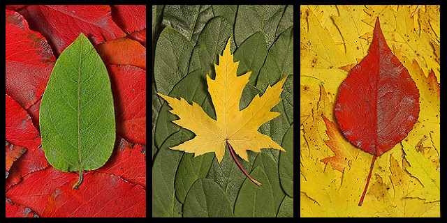
A weekend trip to the in-laws gave me time (and trees) to play around with this challenge. My original idea was to desaturate the background leaves in each frame, but once I got the individual pictures finished, I felt the color backgrounds gave it more punch.
Hope everyone likes this one as much as my wife and I do...
post challenge :
Wow. Thanks everyone for the comments and votes. Among this caliber of competition, I'm quite happy with anything in the top 10.
And to the beautiful soul who put this on their wish list, the 5x7's of each leaf should be available to purchase soon...
Statistics
Place: 7 out of 234 Avg (all users): 6.8090 Avg (commenters): 7.7000 Avg (participants): 6.4876 Avg (non-participants): 7.0753 Views since voting: 4695 Views during voting: 510 Votes: 267 Comments: 38 Favorites: 30 (view)
I love how the colors are arranged in this. Reminds me of an almost rock-papper-scissors succession. The green of the first leaf becomes the background for the second panel. The yellow of that the background for the third, and the red of the third the background for the first. Pulls me right into the picture, directing my eyes left to right and back to the beginning again. That having been said, I think the thickness of the borders is a bit of an obstruction - something slightly thinner and maybe lighter might make this more powerful. Someone suggested a dark brown.
This is lovely - the only thing I don't really like is that border is black. I think a more natural looking color (perhaps dark brown?) would complement this better.
6 - Nice. Good coloring. Criticism; not much, not sure on the 'base' choice of leaf for the middle shot/#2, doesn't seem to 'fit in' with the others, color yes but the shape/type no, in my opinion. More definition in the 'top' leaves especially, would also have made this better in my opinion. Up to 6 from 5.
Very effective use of colours, shapes, textures, which each compliment one another. To me, this 'links' each frame, and this really answers the triptych theme.
Doesn't autumn big a beautiful array of colours. And you used them very nicely. I would have liked to have seen the green in the center match the bightness of the green single leaf, since they appear to be the same kind of leaf.
Very nice, love the constrasts of color and it flows very nicely with the round leaves on the outside. I like how you used the opposite leaves as the backgrounds. Well done.
This is a nice composition - well executed. I could see this in a poster shop or on a wall somewhere. Looks like it may have been a touch over sharpened, but still a striking picture.
One of the 2-3 best of the "designer" shots. Very organic triptych, nice work with colors and forms. I hope you do well. SO many entries seem to be accidental triptychs, as it were; no special reason for them to be triparite except the challenge theme.
I love the leaves on leaves. Great use of red yellow and green. This is really clever. So imaginative and fun to view. It has all of the holiday colors!!!







 Add photograph to your favorites
 Add photographer to your favorites

 Photographer found comment helpful.


