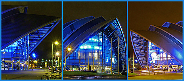
Very interesting idea. I like the perspective and coloring. This was defiantly a hard category, which I think you faired well in. I personally might have played with positioning a little more. Like possibly making the center piece a little more centered from the front the building giving the pieces a central focus. Also maybe making the left side smaller, it almost seems like a larger building in comparison. I would also be curious to try different colors on the borders, possibly a neutral black or white. It is very interesting how brown the sky looks compared to the blue lights from the building. The shots themselves are very clean and they defiantly fill the frames. Good work!
This doesn't draw me in too much, maybe because of the busy nature of the architecture on the limited space we had to work with in this challenge. It doesn't feel quite balanced somehow, but maybe this is how you intend it. The starbursts lights on the left and the one in the center add to the image in a nice way.





 Add photograph to your favorites
 Add photographer to your favorites

 Photographer found comment helpful.


