I have studied your image and have the following to offer:
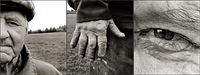
Composition/perspective – Wow! This immediately strikes the emotive forces with a strong punch! As a whole, the three panels, the choices of the individual images, really captures the essence and character of the man perfectly – age, surroundings (the countryside), hard work, a person who worked with his hands all his life. All three panels could stand on their own. Very expressive and makes a very bold statement. The mind instantly starts to create a story and life for this individual. The first panel – on its own this is a strong portrait. What works is the perspective of having the man up front with the horizon at a distance. Gives the impression you are in his world, the country. Perhaps his field or farm where he has worked all his life. The difference in detail between his face and the horizon line this perspective gives is also a strong force and really allows the split face to work. The middle panel – again a very strong image on its own. I get a lot from this panel – the hand shows not only evidence of age, but also of many years of hard work. Again the perspective of the horizon in the distance adds to this. Perhaps intentional, perhaps not, but the stains on the jeans I find also add strength to this idea. Here you have the hand that has worked the land and home for many years. The third panel – of the three this really brings the emotive forces to the front. The strength of the look in his eye is undeniable; determination, hard work, strong love for family, the understanding of his time in life…all of this I get from this single panel. On its own I may like the placement a little different, but in the triptych it is perfect. The focus in all three panels is spot on. As I said, this triptych triggers the imagination to instantly fill in the story. Very well done!
Color – b/w, all three panels have a very nice balance between the light and dark areas. The panels themselves are composed very nicely to create a nice balance between them as well. The separation with the darker center panel sets this up quite nicely. I don’t think this would be as strong a composition in color.
Lighting - No overbearing shadows hiding details. Very nice control of and use of natural light. The first is a little bright in the sky right near his ear and edge of hat, but no detail is lost and it doesn’t become a distraction. All panels are very evenly covered as well. Well done!
Challenge requirements – there is no question this meets the challenge requirements in every respect. There certainly is a story portrayed here, especially if you let your imagination take over while viewing.
Overall/my opinion – this appears to be a well thought out concept that has been translated to images extremely well. The strength of this image just pours out through the screen and captures you instantly. I honestly cannot find anything displeasing here. Excellent triptych!
Congratulations... I'll not be speaking to graphicfunk for a few weeks for bumping you up over me at the last min *grumble grumble grumble* ... but congratulations anyway!
You've shown size doesn't matter and you don't need alot of screen real estate to put forth an extremely powerful image. The lines in this image are facinating. The contrasts are astounding. After studying it, I'm particularly drawn to the commonality of his collar, between his fingers and under his eyebrow shadowing. Maybe i'm just very odd, maybe this is a masterpiece in everyone's mind.
Nicely done. The detail is good. For some reason, I'd like to see another body part on the right, since the center shot isn't part of the left one. Just my personal taste. Still, well done and a nice choice for the challenge. 7
Excellent storyboard of a hard life. There is a smoothness on his nose and cheek that looks a little out of place amongst all the fabulous wrinkles. Did you neat image him?
7 - Good selection and good character. Criticism; tones work well on 1 & 3, 2 undecided on, like the shot, but doesn't 'flow' with the other two in my opinion, not because of the 'character', but the contrast/effect/'feel' - might be the denim/clothing, darker colors, not sure. Hard to explain but I tried.
Wow. Excellent. Really tells so much in so few pixels, especially the eye which was very, very well-shot. My only quibble is that maybe it would have been balanced a little better if the eye or the face (which seem to me to be the most important shots) was in the middle? Still... going in my favorites list for sure. 9.





 Add photograph to your favorites
 Add photographer to your favorites

 Photographer found comment helpful.


