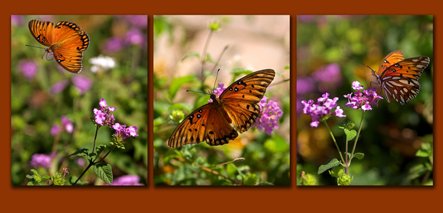
This is really lovely, Laurie. Everything about it is just right, I like the fact that you left space at the bottom for text to be added. What a nice thing that your town has such a beautiful garden in the winter.
Wonderful photos! Great light, colors, composition, and sharpness! I would have preferred a simpler border style, but that's just personal taste. Very nice work! Good luck.
Excellent coloration. It doesn't seem like November wherever you are. (of course it could be the southern hemisphere) The border is open for critique in this challenge and I don't like it. I like the color, but not necessarily the 3D portion. I'm not gonna knock you much though. 8
Kind of a giveaway as I was checking out your website today :) Very beautiful. I love the shadow effect for each individual shot. Looks more like artwork hanging on a gallery wall instead of a typical flat triptych shot.
Wow. this really stands out. I think your score would end up even higher if you used a consistent border width. There is even difference between the top and bottom. I think you definitely picked the right color scheme though.
6 - Very good. Criticism; undecided on framing color choice, it works, but I wonder if a different color may have enhanced the butterfly (and flowers) more. Not sure if the slightly top placement was deliberate, but it also 'works' in my opinion. 1 & 3 are nice 'catches'.





 Add photograph to your favorites
 Add photographer to your favorites

 Photographer found comment helpful.


