I have studied your image and have the following to offer:
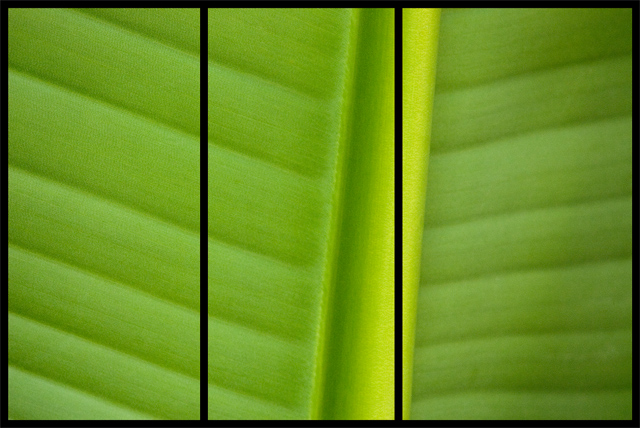
Composition/perspective – two things hit you first when you view this image 1) the panels are not of equal size and there seems no reason for this the way it is set up now; 2) the center stem of the leaf is deliberately cut by a dissection line. If the panels were not of the same size, but the center panel contained the whole stem, this would lend sense to the different sized tiles. Even a diagonal division would have worked here if it matched the stem angle and would have placed more emphasis and strength on the divisions instead of them becoming a distraction. This also would have helped since it is a single image with not really much to grab you except for the natural lines/symmetry of the subject itself.
Color – the natural color and variations are preserved quite well in the image. The texture of the leave allows for a lot of subtle streaking in the green giving more contrast and giving it more depth in the transitions. The bright side of the stem provides a real nice contrast being more yellow and allows more definition of shape come through.
Lighting – hard to tell what was used – natural/flash…nothing is overbearing or blown out. There are not bright spots, flares or dark shadows to contend with. Along with the color, the two strongest elements of the image.
Challenge requirements – in the broader sense, this meets the challenge requirements for triptych. However, I feel it falls short here due to misplaced divisions and panel size discrepancies. Also, there is no apparent story or concept, just portrayal of an object. This makes the division into a triptych more critical to get right.
Overall/my opinion – as a single image this would be a nice abstract or macro shot. The detail and focus are good with good control of the lighting used. The natural lines and texture of the leaf are strong elements and could carry it by themselves. I think trying to make this fit the triptych challenge was not the best choice the way it is divided. A wider center to include the whole stem with equal side panels or angled dividing lines to be parallel with the stem. There are certainly other possibilities. The image has potential, just needs more attention to the details.
The photo is really strong, but the right panel being slightly larger than the other two is distracting. As one of my art prof's told me, if you are going to break a rule (or tradition) do it boldly so there is no mistake that you intended it.
This is a very gentle green, indeed. The image itself is extremely appealing, sich and gauzy and soothing. But the overlaying of the triptych seems to me very much at war with the image itself. What I find especially odd is that the three panels are NOT the same size, so clearly you were putting thought into exactly where the panels should break.
In other words, you consciously used the rightmost panel-break to split the raised stem of the leaf. And I don't know why you made that choice. I am presuming you had a very specific reason to do it, but it seems to me to be the wrong choice here. I'd be interested in hearing why you did it this way, what you were after. Feel free to PM me if you wish.
Perhaps if you had flipped or reversed (horizontally or vertically) the middle frame, you would have achieved a truer triptych. As it is, it's really just a closeup of a leaf with two black lines on it. (And, yes, gentle green.)
I know this meets the challenge, but I am not a big fan on just cutting up one nice shot into 3 with distracting borders. Seems too easy, no real creativity required.






 Add photograph to your favorites
 Add photographer to your favorites

 Photographer found comment helpful.


