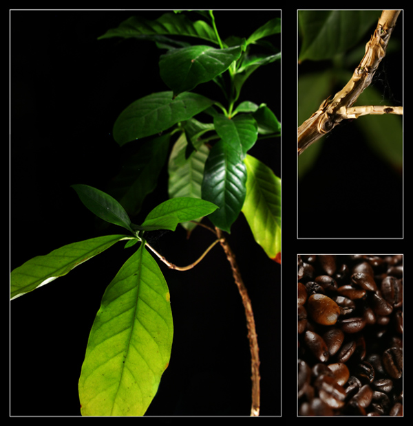
beautiful image, the green is great just perfectly saturated. the softness increases its the pleasant nature. The reflection on the beans are not to harsh and therefore create a fresh appealing look.
5 - Good idea, well done if it is original. Criticism; it is a shame there are no visible beans on what I assume is a coffee plant (apologies if they are there but lost with size restrictions). Has a 'commercial' type property to it that I can envisage being used in such a business. Colors are good, not sure on the inner white/gray/blue frame, but it does work. Maybe a different 'composition'/cropping of the top right/#2, not sure.
This is the kind of picture I would expect to see in a high-dollar advertising campaign (and that's a good thing!). Beautiful lighting, interesting layout choice, gorgeous color.
I like it. You made something meaningful in its own way, and interesting, rather than just following the challenge theme. I like the narrow depth of field on the beans, but it's hard to figure out what the stem is at first glance.






 Add photograph to your favorites
 Add photographer to your favorites


 Photographer found comment helpful.


