I looove the drop shadow effect (I know it's not the focus of the image but I thought I'd point that out). These pictures look wonderful together. I've always loved black and white images. Seem to make things look older and proffessional. Great work.
Quality, this could be on a wall. I'm a lover of simplicity in photographs - to me they can be the most powerful images . This is a fine example of that. Congratulations on your high finish. Should have been a ribbon !
-Lisa
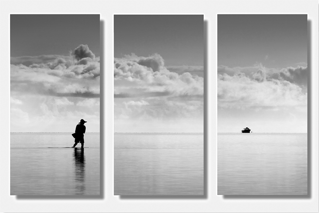
A finely-balanced image with a great deal of emotive content, one of my high scorers. I'm not quite comfortable with the balance of the white space here, but I am trying to view them as I suspect you intended me too, as 4 panels floating borderless and unframed on a white wall.
I'm not a member so I can't vote, but I would give this a 10. I love it! The sky, the silhouette, the reflection--everything about it is captivating. Best of luck. Can't wait to see this ribbon!
Impressive, this has a magical feel to it. The dark silhouettes agains the lighter tones work beautifully, love the absence of subject in the centre panel emphasising the vastnessof the sea The reflection is great too. 10
It seems entirely arbitrary that this has been cropped into three frames - sure, that was the challenge and all, but does that framing ad anything to this scene? I cannot see it, if so. It would, I think, have been a pretty if fairly orthodox shot without that split. I was, and am, hoping for some genuinely adventurous use of the idea of presenting three frames together - some sense of progression, of the importance of the different scenes, rather than arbitrary division.
I love this picture! I love it a little less as a triptych. It works okay, but not perfectly. Maybe better without the drop shadow, with just borders instead? With a black background! But still, love the photo. :)
This is how I understand triptych - not just dividing a picture, but creating a set of relatively independent and self-containing pictures that together makes interesting entirety...10
It is just amazing what a difference an effective boarder can make in these triptychs. Without the addition of the shadow, i feel the image would have been lost in the white. The reasons i like this triptych is that the man is in ilhouette, with a ripple from the water at his feet that pulls your attention into the section frame. The distant silhouette of the boat then pulls your eyes into that final frame. I would have liked to have seen the sky/clouds a little darker on that third frame to match the intensity of the clouds withthe first.
Yes, this is what a one picture triptych is supposed to do. You have a continuous image, but have subjects (or lack of) which differ in each panel. Love it. I go back and forth about the 3D effect. I'll just leave it without comment. :) 9
How does the division of your picture into three frames enhance the photo? How does this "tell...a story or illustrates a concept or object" better than the original image?
Excellent image with a very classy bit a frame work, really compliments the image.I hope you do well with this I enjoy simplistic images that pack a punch. Good luck as this deserves a ribbon
This is pretty neat, I have to say. I'm not sure about the shadows though, I'm thinking they are a touch distracting and maybe break it up a little too much.
Beautiful photo. I love how the figure and the boat are so dark compared to the rest of the photo. This is a great example of a photo that actually benefits from being divided into three panes. In the one pane we have the figure (what a great pose!), in another pane we have the boat in the distance, and the third pane is empty and separates them, enhancing the sense of wide open space. The tonality is gorgeous, without any blown highlights. My only nitpick is the "drop shadow" type of panels. I personally would have preferred plain panels, since this photo is so beautiful and is not in need of any additional enhancement. But that's just personal taste. Again, great photo. I'm jealous, cuz I like it better than my own entry :) Good luck in the challenge. 9.
7 - Very nice, and simple, works well. Criticism; not sure, just seems it needs a little 'lift' somewhere, not sure how or where, be it colors/toning, outer frame, don't know. Of course, it may just be the small size/restrictions, which I have taken into consideration.
This must surely ribbon. It's exquisite in everyway. The stark black silouhettes against the soft tones of grey is very pleasing and the composition is top notch. Nicely set-up transitions. 10
simple and so well done with the two silhouettes on either side. I like the shadowing of each image against the white background. Like they are coming out of the wall. NICE. 9
Of all the single-image-divided-in-three-parts entries I've seen so far, this is the best. The proportions lend themselves really well to it. Beautiful, and evocative.
Stunning. I love the silhouette against the pale ocean and sky. The shadows of the three images also looks really lovely here. I've rarely seen an ocean look this glassy and smooth. Wonderful idea for this challenge. 10.





 Add photograph to your favorites
 Add photographer to your favorites


 Photographer found comment helpful.


