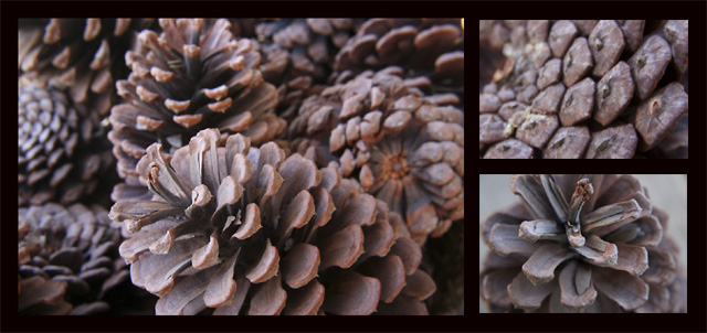
I like the layout you've chosen but I think I'd prefer the top righthand photo to be more different from the larger photo than it is. Those two photos also seem to be a bit out of focus.
6 - Nice. Criticism; seems a little 'hazy', but could be something lost in the resize, not sure, so a little more vivid in color, if possible, contrast dependent, may have made this better in my opinion. Nice and 'simple'. Also may have worked well at 640x640, if possible.
To me there is a little bit too much of the same in this triptych. The upper right image is too similar to the left side image. Maybe choosing a different color tones for each image would have helped to differentiate them? I like your choice of subject.





 Add photograph to your favorites
 Add photographer to your favorites


 Photographer found comment helpful.


