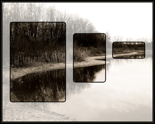
This is a shot of the little pond at McNamara Landing on the Grand River, in Bunker Hill, south of Lansing Mi. I gave the photo a tri-tone, moody treatment that I have been favoring for these stark, late autumn scenes.
I thought the image fit well for this concept. The idea was to 'slice' sections out from this scene, following the shoreline, and my intent was to use the different sizes, to follow the shoreline back into the image, and give some depth to the image overall.
It is all from one photo. I first processed the photo. Crop, usm, tritone, screen layer, overlay, layer, levels, hue/sat, and curves. I then cropped the slices off. Put the original image on a new layer, dropped the opacity to 50%. Then copied and pasted the 3 slices in their spots, (the alignment was a pain). Then added borders to the slices and the whole image and resized.
I know, probably another love or hate kind of thing, maybe just hate :-) , and it is veering away from the traditional type thing, but I like it, and hopefully maybe a couple of other folks will too.
Thanks for checking out my pic :-)
Statistics
Place: 30 out of 234 Avg (all users): 6.2862 Avg (commenters): 7.7188 Avg (participants): 6.2205 Avg (non-participants): 6.3397 Views since voting: 3186 Views during voting: 702 Votes: 283 Comments: 45 Favorites: 17 (view)
Ok... I just realized that 3+ years ago this was among my selections in the "Pick your fav image from the person above you" side challenge. This week I had the realization that "picking a favorite" should have included a comment about why. So I've been back over the last 1600+ posts to find my choices and make amends for my omission.
Although it seems you've not been active here for a while, here's my belated comment:
I'm really glad that I took the time to go back and see my earlier choices. This remains as one of my favorites and the technique is an intriguing one. I may be inspired to give it a shot soon. This exercise of mine (returning to view an image after several years) confirms my appreciation of your photo.
Returning for the compliments that are due this wonderful and creative image.
The use of the tones used works very well here, and the far right panel is pefect to break up the centered symmetry.
One of my top 10 favorites in this challenge (8)
This is an interesting take on the challenge. I just feel like there is something missing. I just can't put my finger on what. I thought maybe it was the color... or mlack thereof. I know that it bothers my sense of balance to have the middle box cut off the tip of the curve there, but other then that I just can't figure it out. Very nice concept, though. Good Luck!
This is a fantastically creative take on the theme. I love where you chose the frames. The image really plays well to be broken into 3 smaller sections with the curves and perspective of the bank. I can see this as a website layout on so easierly. Bumping Up.
How does the division of your picture into three frames enhance the photo? How does this "tell...a story or illustrates a concept or object" better than the original image?
A different take. I wonder how harsh voters will be on the non-standard division of the picture. I like it, even though it feels as if my eyes are skipping across the water.
I like that you approached this challenge differently. One photo with focus set on three separate sections of it. I like how the sections follow the shore line in size and perspective. Very nice job. Top ten from me. 9.
Simply stunning! Such a tidy interpretation of the challenge. Lovely monochromatic appeal. So well thought out, and perfectly executed. A ribbon, for sure. 10.
I like that a lot; it's quite original. One small quibble; the corners of the images and the corners of the outlines don't match up exactly, and it's a bit distracting. But I like the idea, and overall the image is very pretty.






 Add photograph to your favorites
 Add photographer to your favorites


 Photographer found comment helpful.


