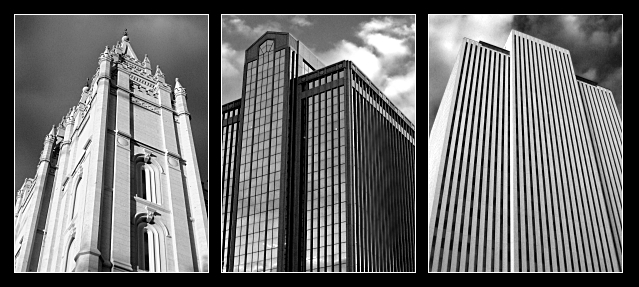
Very stark and imposing. I find myself thinking this would look better with the left and middle panels switched for compositional rather than tonal symmetry.
love the tones of the images, the lines are what makes my eyes go "woobly".
The temple is great with nice vertical lines, center photos lines leaning right of vertical, then COB is pointing at one oclock - so the impressing as I "read this" is the whole thing is kind of tipping over. I think the lines need to match, or offset each other with the vertical in the middle, for this kind of treatment (triptych).
But did I mention I think the black and white conversions are just spot on - excellent. Did you happen to shoot this at lunch? 7
Nicely executed, your is obviously a sure hand. I don't think you found a subject that really made the most of the challenge though - this is just three buildings in the end, rather than containing any strong sense of historical pregression, or overall movement through frame.
Nice grayscale! You did well. I may have put the two modern buildings on each side as they echo each other better. The classical building seems to stand on its own a bit. 7
The b&w looks good. I like the look of the buildings. I would have put the church in the center with a more straight on look. That way the two similar buildings would have flanked the church.
It might have been nice to put the more ornate/church looking building in the middle. The style of the two on the right are somewhat similar, in that they're more modern. It would be nice to break them up. Also their backgrounds of sky with clouds are more similar. It might be nice for contrast to change so that the left photo is in the middle.






 Add photograph to your favorites
 Add photographer to your favorites


 Photographer found comment helpful.


