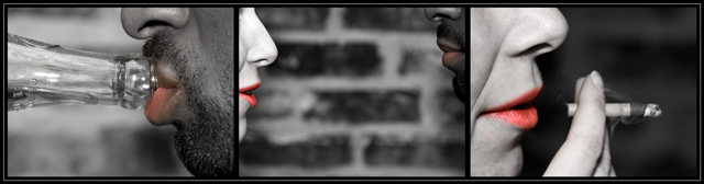
Challenge:Triptych (Advanced Editing IV*) Camera:Nikon D70 Location: ally by building that i work at Date: Nov 13, 2005 Aperture: f3.5 ISO: 200 Shutter: 1/100, 1/125, 1/500 Galleries:Macro, Diptych / Triptych Date Uploaded: Nov 13, 2005
natural light, 3 different shots, desat. all but the lips with PS....in raw i changed the wb....
oh and curves....
resized and boardered.....
thanks for the comments, views, and votes
i hope the title is ok i am thinking of just cutting it down to lunch break, but i want it to be clear....ok maybe it is too clear..i could be beating u iewers over the head....then again u might need a good beating........ok i'm done...
shot with 50mm nikkor manual f3.5 macro
Statistics
Place: 151 out of 234 Avg (all users): 5.4061 Avg (commenters): 6.1667 Avg (participants): 5.2314 Avg (non-participants): 5.5571 Views since voting: 843 Views during voting: 410 Votes: 261 Comments: 13 Favorites: 1 (view)
I gave your photo a 2, and I will explain why. If this is supposed to mean that drinker and smoker meet at lunch, then it should have flowed that way. Him, her, then both. You have both in the middle. I also don't like the the theme of drinking or smoking, and the partial b/w with color really doesn't do anything to enhance what I find to be a bit blah. The concept was nice, but the interpretation you gave of it is was not appealing to me. Also, technically, in the second photo, the girl seems to be too bright and the man too dark. He nearly blends in with the background. Sorry, but I thought I should explain low votes. I usually give comment on my top lows and top highs only.
OK I can see a story in the making, but the order of panes seems to be odd, at least for any story I can read easily into this. the skintones don't match between frames.
interesting take on this. good luck
More like "Smoke Break"! This is cool. Definitely different. This is a photo you can look at for much longer than many of the predictable, seen-it-a-million-times photos that you see. The score of this image will be much lower than it deserves, I'm afraid. I hope I'm wrong...
I normally don't care for selective desaturation, but here it clearly contributes to the story. The entries I've seen so far are for the most part very good images, but this is one of the few I've seen that requires a triptych to tell its story - so it's the most fitting for the challenge in that sense.
I hate to say it, but I don't like the selective desaturation here. I do like the concept, each photo, and putting the individual people opposite of where they are in the middle.





 Add photograph to your favorites
 Add photographer to your favorites


 Photographer found comment helpful.


