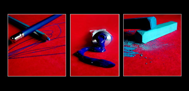
I was thinking colors for this one. All items the same color. Was thinking between red and blue, then decided, "hey, why not? I'll do both!"'cause that's just the crazy type of person I am :-)
I think I sorta messed up on the sizing and made it a tad small. Oh, well. It was fun.
Statistics
Place: 44 out of 234 Avg (all users): 6.1679 Avg (commenters): 7.5294 Avg (participants): 5.9453 Avg (non-participants): 6.3714 Views since voting: 1457 Views during voting: 440 Votes: 268 Comments: 24 Favorites: 4 (view)
This is a very bold and striking image. The strong reds and blues are well represented, and the balance between the three images works well: the composition of the middle image places the paint a little lower than the blues in the outside images, creating a pleasing "smiley" curve to the blue dynamic. Your decision to tie the images together using colour and theme works well. The images are sharp and well defined.
By way of criticism, there is something a little odd in the reds, particularly noticeable in the middle image. There is a slight vignetting to the two outside images, which is pleasing to my eye, but there appears to be an issue with blown out reds at the top of the middle frame: it resolves down to a single colour, whereas your other images retain some texture and detail throughout.
The framing of the triptych is fine, and the narrowing of the central pane does not bother me, but I am not so sure about the frames around each of the panes: the frames look a little fringed in places and very slightly uneven. I wonder if this is a result of creating the image, including the frames, at full resolution then resizing - that might explain it. If so, at this resolution, one tends to get a cleaner effect by resizing the images then adding the frame at the lower resolution.
These are minor criticisms of a great image - congrats on 44th, and good luck with the next challenge!
Great! i love it, haha, reading your comments, haha, ya, your SoOoOoOooOoOO wild Anna ;) I love it, and wished i could have had acces to a computer during voting!! sadly i was away, but looking at them, i really liked yours, and it just screamed your name... aside from having it under the 44th place thing ;)
5 - Good concept, nice bold colors. Criticism; maybe a little too saturated, or it could be that the black frame enhances the colors more so perhaps a different color choice of framing, not sure. Not sure on the thinner middle frame, maybe more 'fore space' in all and more vertical, who knows.
Beautiful color scheme with the blue and red. Great professional feeling to the shots. The triptych overall seems slightly off balance but still a ribbon contender in my opinion.





 Add photograph to your favorites
 Add photographer to your favorites

 Photographer found comment helpful.


