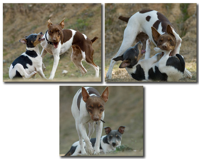
Hi everyone...thanks for all your nice comments. I really didn't like how small the pics looked to resize them at 640 so took a chance and put them this way. I guess it wasn't well recieved but thanks anyway for the great comments.
A really cool progression with excellent, sharp photos but the layout really detracts. The empty white space makes this feel more like I'm looking at the photos in photoshop than viewing a final presentation. Flip that bottom one up to the side and you've got a great image.
Really cute photos but the layout just doesn't work well for me. I would have rated this much higher if it had been layed out better with borders rather than drop shadows. 6
Good clear pics with nice lighting. The triptych frame is a little different than I'm used to. Colors on the dogs look great and you've captured some cute scenes.
This is a fabulous sequence of photos! I'm not very keen on the layout, but does allow you to make each of the three bigger than you could otherwise, which is helpful.
7 - Very good. Another good use of the triptych to show a 'range'. Criticism; undecided on the framing/placement choice, it works but, if possible, depending what you had to work with, the bottom one full width, may have balanced this out better, or rather reduced the 'dead space' there. I do like the bottom shot though, good capture - as is on all. Good colors and contrast control. Just a touch more contrast in the bottom one as is with the top two, would also have made this better in my opinion.
It looks like it is going after the photographer now...
I'm not sure about the composition of the images. I like it, but at the same time it bothers me that there is so much empty space in the 2nd row. And, the image #3 is smaller than the other two. It does break the monotony, but not in a good way, it seems to me. Good luck!





 Add photograph to your favorites
 Add photographer to your favorites


