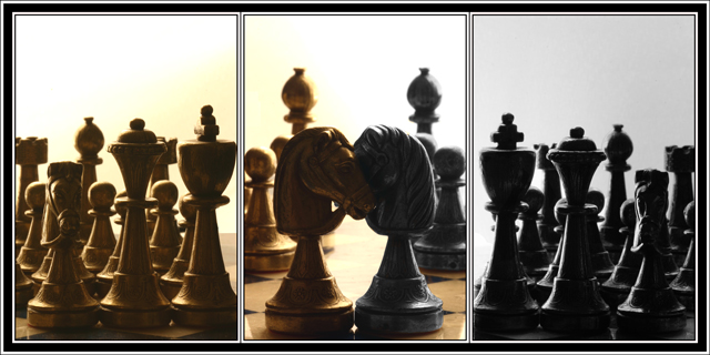
White and Blacks were living each on their side...Until one day R met J...
This picture is done from 3 different pictures. The first one was the middle one, the others were taken from a rotation of the pod...
The light is frontal and the overexposure in the back is intentionnal and was reinforce by the post treatment.
Small crop to fit the dimensions/organization.
Duplicate of layer/ desaturation on one/ partial deletion on the other to display the desat.
Dodging to remove some parasites and try to make the ensemble uniform...
Statistics
Place: 129 out of 234 Avg (all users): 5.5448 Avg (commenters): 6.2857 Avg (participants): 5.3689 Avg (non-participants): 5.6918 Views since voting: 1166 Views during voting: 464 Votes: 268 Comments: 19 Favorites: 3 (view)
This is excellent. If I was doing the voting, this would have been a lot higher up than middle of the pack. I feel the story and emotion ascribed to the inanimate chess peices is superb.
Thanks all for your votes/comments.
Regarding the details I recon that reduced this way they are not really viewable but I can ensure they are there.
In fact I spent a lot of time on the post treatment and when I found something I was pretty happy with I didn't have anything left to change the little details that were worrying me like the part too dark on the right or too light on the left.
My initial idea was really to oppose 2 families that would merge in the central picture. I appreciate the comment that made the reference to Shakespeare ;)
Looks likt they are telling secrets. ANd the others are trying to listen in. I wish it was a little less dark so we could see the details on the Knights (is that what they are called?) faces.
I wonder if a suitable line from Rome and Juliet mightn't have encapsulated the idea of love amidst strife more neatly than your title? There is a sense of opposition in your composition, and I like that sense of balance you've achieved - and yet that title makes me think you've missed that potential entirely.
I really like this shot and it's artistic quality. However, looking at it is making me strain to see more details in the pieces. With so little light, it's difficult to see much... a down side but also one of things that I like about this set up. The colors are also great; the division of the wedding parties split up by tint is a fantastic element. In any case, I hope that you offer a print of it so that I can hang it in my livingroom! I give it a 9!
**edit....I was on a bad monitor... my home computer sees the details in front very well...I'm bumping up the score too. :)**
Love the idea but feel the execution could be improved a bit. The right side feels quite a bit flatter than the left side and gives the whole thing a sort of uneven feeling. I do think the idea lends itself well to a triptych, though.
6 - Good concept, well done if this is original. All nice shots. Criticism; like to see more detail in at least one frame, obviously preferably the center one, but perhaps you lost a lot in the resize. 1 & 3 do not seem to be cropped uniformly, which may be intentional, but in my opinion, would have looked better if they were, and it were 'balanced' better.





 Add photograph to your favorites
 Add photographer to your favorites


 Photographer found comment helpful.


