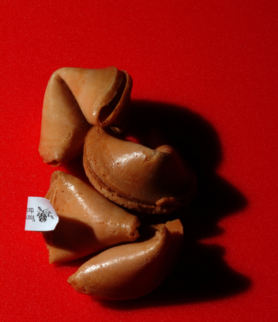
This was underrated. I bet it's because most people didn't see the shadow and gave it an average 4/5 vote. Still, I really liked it. I think it's very creative and imaginative.
Oooh! Creative! I was kind of confused about why anyone would choose to "dramatically light" fortune cookies. Good thing I came back to visit this one a second time, and then re-read the title, so that I could find the hidden meaning! Nice work!
Wow - at first I did not get this, because my eye was drawn to the fortune slip, and completely missed the shadow. Not necessarily a bad thing - I enjoy finding "hidden treasures"
This would have perhaps looked better if the colors were complimentary, say, an neutral color for a backround. The red clashes in my opinion. I would like to see this with an off-white backround.
Very nice contrast between the red and brown. Thought there may have been a little too much shadow, though. Perhaps moving the lightsource a little more right?
You don't want to know what I thought this was at first glance :-). Lighting from above to reduce the shadows some on the right might have helped this.
----------------------------------------------------------------------
11/23 Edit. Completely missed the shadow, and therefore the point of the picture. Sorry! This was a clever idea.








 Add photograph to your favorites
 Add photographer to your favorites

 Photographer found comment helpful.


