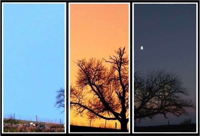
First off, I took a shot at Uconn of this tree which I was going to enter in landscape, but changed my mind. When this challenge came up, I immediately thought of this tree done at three different times of day, one taken in the morning, one taken at sunset, and the other taken at moonrise. I used night setting on the moonrise picture, and shutter priority on the other two. Editing:
Picture 1 - Adjusted brightness and contrast, dodged detail on rocks, layered foreground to adjust color balance. Cropped from right.
Picture 2 - Changed color balance from gray to magenta to yellow to orange. Used noise pen to reduce noise around branches. Also applied neat image to smooth out photo better. Used layers to adjust brightness and contrast. Treated with an unsharp mask. Cropped from left and right.
Picture 3 - Flipped image vertically so that branches would line up. Original picture was taken from opposite direction of other two in order to get the moon in the picture. Used bucket fill on sky to make it a darker blue. Used paintbrush on upper branches using blue from sky to hide the fact that they were not aligned with second image. Adjusted image to be less bright with a bit more contrast. On the moon, I used paintbrush with moon color to make the moon a little larger and to add a dark highlight on the right. Cropped image from left and worked with scale to try to match up the image as much as possible with the second one.
The image came out nearly as I envisioned it, and whether it places or not, I am very proud of this one.
Statistics
Place: 120 out of 234 Avg (all users): 5.6194 Avg (commenters): 6.3000 Avg (participants): 5.4113 Avg (non-participants): 5.7986 Views since voting: 1554 Views during voting: 547 Votes: 268 Comments: 31 Favorites: 0
i was just looking through & i really like the idea & from far away it looks really really good.
but if you get close up its not just soft focus [trust me, i know a lot about soft focus & how annoying it is when peple complain] its more just blurry =/
dang.
i really really liked this too.
but the soft focus doesn't bother me ALL the much.
it just would be better a little softer =]
I agree with the comments below regarding the softness and focus issues of the shots. The idea is awesome, really great! For composition, I would have liked a bit more of the tree in the daytime shot as it appears really blank compared to the other two panels.
Hi June, you had a great idea here and certainly went to a lot of pains on the execution. If the outer images had been sharper without looking slightly over-processed, it would have been a beautiful triptych. Your score is certainly decent and you're definitely on the right track. So keep up the good work and great ideas rolling in. :)
An interesting idea and a nice attempt. The outer two photos are rather soft while the middle is more in focus. I think this lack of continuity hurts the overall compilation.
I would have liked it a little sharper, especially in the left panel, but this is by far my favorite photo of the challenge. well concieved and well done. good job.
Great idea, a bit let down by: 1) out of focus feel on the "day" shot; 2) poor triptych execution (there is a kind of line visible between the 1st ans 2nd pic); and 3) a bit too much JPEG compression.
But as I said, the idea is very nice, and I think it has a lot of potential. - 6
Very interesting effect! I really like the hree different times of day...very cool idea. The middle frame looks very distinct, but the first and last frames look a little soft to me.






 Add photograph to your favorites
 Add photographer to your favorites

 Photographer found comment helpful.


