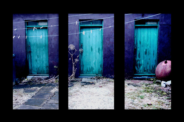
I found this blue shed with the three blue/green doors in the backyard of a house in Reykjavik and though instantly of the triptych challenge.
I divided the photo into three equal part, cropped a little bit, used unsharp mask, a little vivid light, color/contrast balance and made another layer with thick black border. The white spot in front of the shed is snow, not overexposure like many often thinks of photos from snowy Iceland.
Camera Model: DCP-200
Equipment Maker: SONY
Date Taken: 11.11.2005 15:28:04
Color Representation: sRGB
Subject Distance:
Flash Used: No
Focal Length: 7.9 mm
F-numer: F/2,8
ISO: 100
Exposure Time: 1/40 sec.
Metering Mode: Pattern
Exposure Compensation: 0 step
Statistics
Place: 92 out of 234 Avg (all users): 5.7692 Avg (commenters): 7.7333 Avg (participants): 5.6953 Avg (non-participants): 5.8345 Views since voting: 1305 Views during voting: 463 Votes: 273 Comments: 19 Favorites: 1 (view)
In my opinion this is underrated, I really like it, especially the colours in it and a great idea for a triptych. I would probably have given this a 7 if I had voted.
There are two things that sort of make me think it might have scored higher. First, it doesn´t seem really sharp, did you forget to sharpen it after resizing it? Secondly, the black borders are a bit too much for my taste and kindof take away attention from the shots.
Interesting colors and subject. Find the forground a litle distracting and think it would had been better to fill the frames more with just the doors and walls and cutting out more of the forground.
Really cool colors on this shot!! I like the subject choice as well. The triptych frame is a little too wide between the three sections for my taste, but no big deal :-) I don't vote on the frames :-) All in all, I dig this shot!
I love the scene. A criticism: the three doors seems to come from one picture. This is not a problem, but there's an evident distortion in the two external ones. Maybe, using three vertical pictures would have given you more alignment and more pixels... If I'm wrong, forget it.
I just love this. The cool violet with the turquoise and that touch of plum/fuschia. Really a neat image! I like how the clothes line connects them all. Well done.






 Add photograph to your favorites
 Add photographer to your favorites

 Photographer found comment helpful.


