I had something else in mind for this challenge, but didn't have time to shoot it. So I decided to go with this simple idea.
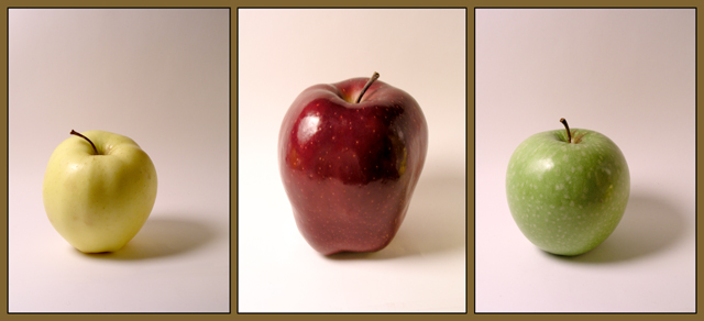
Let's see how many people are bothered by the fact that the green apple is too close to the red apple. It bothers me, but I've already eaten all of my subjects, and I'm pretty sure the editing required to "extend" the background a bit would be allowed in this challenge. So I'm sticking with what I've got.
Photoshop:
-Cropped
-Separate levels adjustment on each apple (3 different pics)
-A little minor color adjustment on the red and green apples
- Created the "frame" to make this a triptych
Statistics
Place: 164 out of 234 Avg (all users): 5.3257 Avg (commenters): 5.4000 Avg (participants): 4.9915 Avg (non-participants): 5.6014 Views since voting: 1135 Views during voting: 401 Votes: 261 Comments: 10 Favorites: 0
technically this has a lot of room for improvement... some things to consider -
- reducing the glare on the apple (soften the light source by putting a white bed sheet in the path of the light to diffuse it)
- remove the cast shadows (again this is a lighten problem, diffusing the light will help)
- brighten up the colors (can be done in post processing, lots and lots of ways to do it)
- inconsistent backdrops (it is white on the left side of the middle panel but warm grey elsewhere... for these type of shots a clean white backdrop is usually best)
Hope you dont take my comments the wrong way, just trying to be helpful and constructive.
4 - Nice and 'soft', coloring and 'focus'. Criticism; whilst I think the frame color suits the background colors I am not sure it suits the subjects. Overall, while nice and 'clean', this lacks 'something' in my opinion, maybe just a richer coloring or uniform crop, may have made it better, not sure.






 Add photograph to your favorites
 Add photographer to your favorites


 Photographer found comment helpful.


