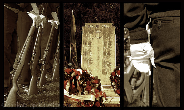
This is not anywhere near my usual subject. But, I felt compelled to put it together after being involved in the Veteran's Day Ceremonies. I could have easily gone with flowers but it really wouldn't mean anything. And I had to enter just to see if I could do it. So here it is. I like it, and I hope you will too.
Statistics
Place: 49 out of 234 Avg (all users): 6.0696 Avg (commenters): 6.9583 Avg (participants): 5.8000 Avg (non-participants): 6.2973 Views since voting: 1313 Views during voting: 462 Votes: 273 Comments: 25 Favorites: 1 (view)
6 - Like the concept. Criticism; not sure on the toning/desaturation, especially at this size. I think color would have been better in my opinion, but that's your call. Again, difficult with the size restrictions, but perhaps a little more 'space' to the right in 1 and left in 3, and maybe centering of the Honor Roll, may have made this better in my opinion.
i like this shot - i think it might have had a little more impact if the images weren't quite so dark. i'm having a hard time seeing the seperation lines near the tops - then again, that could be my monitor.
This is a moving entry (and I'm not the most patriotic person in the universe, that's for sure). It's emotional. Your color choices have really contributed to that. I like the crops you've chosen, too. Nice job.
[i] Compositionally very strong. [ii] The highlights on the glove in the third panel are all dead and gone. They could possibly be saved with masking adjustment layers or burning them in. Try selecting highlights with CTRL-ALT-~ (tilde), copying to a new layer with CTRL-J, and setting the blending to multiply. That is often helpful to me. [iii] The differing color treatment of the middle panel is throwing me off. I would guess that you wanted to ensure primary focus on the middle panel - perfectly understandable - but my eye is strongly drawn to the red in the flowers to the point of real distraction from the rest of the image.
Wow! Very powerful image. I love the selective desat in the second image. The glove in the third image has some blown highlights which takes away from the overall image, but still I give it a 9.
This meets the challenge perfectly. Your three pictures tells a story. Nice size to your photo too. I had sizing problems when I tried to use 3 pictures. Good luck
I LIke this concept, was thinking of something similar myself, just couldnt figure out how to pull it off, courage, honor, work well, not sure how the third panel relates to integrity, but i still like this image. 6. Mike
I LOVE THIS IMAGE. Very good idea, really well done. Excellent use of desaturation. And I like the subject matter as well; timely this week. I can't find a thing to dislike about this image. 10.
Very nice for veteran's day. I don't like the difference in tone between the middle and outside images. I like seeing the line of rifles in the photo on the left





 Add photograph to your favorites
 Add photographer to your favorites

 Photographer found comment helpful.


