PS Work:
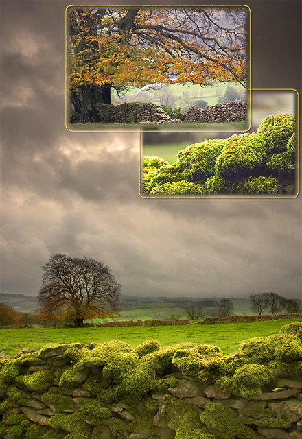
Base image taken with 16-35mm wide angle, processed in Camera Raw twice, once setting exposure for the wall, and then again for the sky. Two layers then added together and layer mask applied to merge the layers.
Dodge and burn to image to highlight the moss wall.
Sharpen all layers
Levels on each layer to equalise the contrasts.
Two inset images taken with canon 100mm f2.8 lens. focussing in on moss wall and again on tree.
Inset images selected with 15px feather and copied into base image. Added 3px stroke to each inset image.
Added photo adjustment layer to warm image up
Finally added a slight vignette layer
Statistics
Place: 2 out of 234 Avg (all users): 7.3209 Avg (commenters): 8.3929 Avg (participants): 7.0656 Avg (non-participants): 7.5342 Views since voting: 17134 Views during voting: 664 Votes: 268 Comments: 99 Favorites: 50 (view)
congratulations on the ribbon, speaks by itself of the art that you shared with us. it was one of my 10's, even through my amateur eyes i can recognise greatness.
All I can say is, WOW! This is the type of photo I aspire to make someday. Congratulations on your ribbon--it is VERY well deserved. Whoever gave you the 1, 2, and 3 scores need to have their monitors or their eyes checked (maybe both!).
Great job Falc. This is a magnificent shot. For one, it's different than everyone else's in the lay out, but it's also a beautiful image with wonderful details, and colors. Absolutely wonderful job. And now one of my FAVS.
Not being a full member yet I couldn't vote on this challenge, but this would have been my top score without question. Beautifully done and congratulations on the ribbon.
Beautiful subjects/lighting, it can't be hinged which violated the theme IMHO, but it's a very nice piece for advertising or décor! Congrats on your ribbon.
Congrats on the ribbon, i liked the images but didnt care for the integration, but i gave it a 7 nevertheless. I guess I am in the minority with bear on this one :-)
Congratulations on your ribbon! The base image is lovely. I have to say that I did not much care for the way the other two images were integrated into this; it feels less like a triptych than a photomontage to me. Obviously I'm in a minority there. Very nice work regardless.
7 - Very nice. Criticism; very difficult, mostly because of the size limitations, but I imagine this looks quite different 'wall size'. The 'inserts' are a good idea, but I am unsure on the 'gold' framing, especially since it has not been applied to the main 'frame', but unsure, as it does still work. The shot/scene itself is excellent and I like the perspective and composition and use of the wall. Slightly curious if the horizon is slanted, but not overly. Like to see even more detail (again difficult at this size) in the moss on the wall, but then - you have done so with the 'insert', as you have also done with the tree. Unless I am mistaken, both these 'inserts' are cropped out of this one picture, and to retain such good detail, clarity and color in them is very good. Perhaps a slightly different crop of the main frame, losing some of the sky/clouds, may have made this even better, but I realize your 'inserts' placing would change completely then. Maybe 'vertically framed' inserts would have 'balanced' better, not sure. Good, seemingly original, application of the triptych technique. review:unsure on 'classic triptych', but I like this nevertheless.
I like your choices on combining the pictures, and great photoshop work all around. One thing I'd like to see is a slightly bigger border around the whole image so the borders on the pictures inside arn't so overpowering. One of my favourites of the challenge
The big image is a 10 (more, if it were possible) for me. The light is amazing, sucking me right into the scene and under those clouds. The two inset pictures are nice, as well, but it some ways feel like they're tacked on to meet the challenge (which they do). I hope you put the main photo in your portfolio after the challenge is over.
The best one ! Simply fantastic ! (My husband would have given you 11 or 12 if this was possible ...). For me you are the winner ! Good luck !
We love the colors , the light , the composition , the elegance and good taste ...
I would definitely vote this in the top 5. Aside from the absolute beauty, I love how you've composed it--putting the two smaller photos on top and tying the whole thing by taking photos of the foreground and background interests. Very well thought out. Good luck.
the three photos you have chosen are all quite gorgeous. I'm afraid I don't think your layout flatters them. both of the upper two are too close to the edges and seem to serve little compositional purpose. I could see a single photograph at the top, possibly centered between the two sides, but the two up in the corner there just don't make sense to me.
Beautiful landscape. The vibrant green against the soft grey sky is great. I like the closeups of the main subjects, they work well as if answering a question.
Now this is just brilliant! I really like the composition of the 'main' photo. And then very creative to compose your trip of 'inset' like closeups. I like how they are overlapping too. Beautiful lighting, and the luminosity of the grassy stones is great. Just lovely, I really like this one. Well done!
i'm not a big fan of the borders chosen for the inset photos, but i think the entry as a whole is quite amazing. congratulations on an obvious ribbon winner...
i really like this different take on the theme. I especially like that you chose close ups of the original scene rather than different angles. It is almost like shring little secrets hidden in the photo. The clouds and stone wall could probably use a bit more oomph, to match the magnificant green.
The background image is absolutely stunning...a winner in any landscape challenge. Unfortunately, the insets detract from, rather than enhance, this fine image. 8
I have a feeling that this may be marked low because the divisions are not the normal conservative ones. Which would be a pity. Because this is the best 'single' picture in the challenge.
I am torn on scoring, I love this picture, but I am not sure if it falls in this catagory. But MAN!!! I would purchase this in a heartbeat. Simply breathtaking. I give you a 7, 10 for the picture, 3 for the catagory.
I love the ominous clouds and the glowing moss. I think the all three individual photos are great, but I'm not a fan of the way they were put together. It looks more like a brochure than an image that stands alone.
Nice! The main picture would be great all by itself! Wonderful green color in the moss/grass, and lots of dramatic sky! I assume there's some post processing in this, and I think you did it well.
This is a wonderful design. I like the two insets. The base image is gorgeous. Definitely one you should use as a stand alone as well. I love the rich almost eery green moss and grass and the overcast sky. I'm amazed you had such good light on the grass while the sky was like that. 10.
This is very pretty and nicely set-up. Not sure that I like the gold around the edges of the inset pictures, a black or white may have been more my tastes, but overall this is a very nice triptych.
I like this take on a triptych. To me it's a study in colour and texture.
What I think might improve it is to have less overlap of the smaller images and maybe have them the same size. Also, the top image I think could be off center a bit.
All three images would be great as standalones. But the whole arrangement has been done beautifully they compliment each other and no one image over rides the other.
The only thing I would have done personally to improve this, would be to maybe crop the base image slightly from the top to bring the other two lower down.
The base picture alone is outstanding, but the addition of the other two just really make the compilation tremendous. I love the rich colors and textures you've created in these pictures. This puppy better ribbon, that's all I have to say!






 Peak District Triptych
 Add photograph to your favorites
 Add photographer to your favorites

 Photographer found comment helpful.


