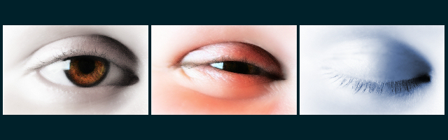
Very nice. I would have explored keeping them all same color indicating the transtition between waking and sleeping. Nevertheless, nice concept and good presentation. Bump.
This photograph arrangement is touching for some reason. I think the colors are great and it warms my heart. My only critique is that maybe the frame is too large on the top and bottom.
nice idea but the descriptions of each reallllllllly don't fit... 2nd eye looks more like a squint than joyfull :) original though, and isn't just a picture chopped into 3 sections (which really isn't a triptych) so grats on that :)
I like the idea, but I'm not quite sure I like the rest. ;) The center panel is not too appealing it it's "in betweenness". Before I read the title, I thought it was a progression of someone falling asleep. The color tints are ok, although a more muted pink might have been better. It's creative though. 6
My favorite is by far the blue one on the right. As individual shots, I like them, but with all of the variation of color as a collaborative effort, it just loses something for me. I've had that problem with others as well. The focus on the left eye is awesome. Clear and tack sharp. I like the single sat of the brown of the iris as well. The center one doesn't depict joy, as you can't really see the rest of the face creating the squinted eye. This was a tough challenge and you certainly made a valiant efford.
Very nice use of space - the smaller height does not bother me at all with this one!
On the #1, the reflection of the window (?) is unnecessary. It ruins it for me. The #3 is perfect, and #2 does not look human, probably because of the another unnatural bright spot.
Lovely composition, good luck!





 Add photograph to your favorites
 Add photographer to your favorites


 Photographer found comment helpful.


